
School Newsletter Template Design: Build a Layout Families Love to Read
Most school newsletters look the way they do because someone built the first one years ago and every newsletter since has copied that structure. The result is often a newsletter that was never intentionally designed and has accumulated quirks over time. Starting from an intentional template, one that is built around how families actually read emails on phones and what information they actually need, can transform the effectiveness of your school communication without adding any significant work once the template is built.
How Families Actually Read School Newsletters
Research on email reading behavior consistently shows that people scan before they read. They look at the subject line, the header, the first sentence of each section, and any bold or highlighted text before deciding whether to read a section in full. This means your newsletter template needs to be designed for scanning, not just reading. Every section needs a clear header that communicates what the section is about in five words or fewer. Key information needs to be in the first sentence of each section, not buried in the third paragraph. Action items need to be visually distinct so families can find them at a glance.
The Core Sections Every School Newsletter Template Needs
A school newsletter template should have a header that identifies the school, the date, and the sender by name. Below the header, most effective school newsletters organize content into three to five sections based on type rather than topic: upcoming events with dates, current program or classroom updates, action items for families, and a community spotlight or recognition. This type-based structure means families develop a habit of looking in the events section for dates and the action items section for things they need to do, rather than reading the entire newsletter to find the one item that applies to them. Familiarity with your template structure improves engagement over time as families learn where to look.
Visual Hierarchy: Where Families Look First
In any newsletter, families look at the header first, then the first section heading, then any bold text or highlighted call-outs, then the images. If the most important information in your newsletter is buried in the third paragraph of a middle section with no visual emphasis, many families will miss it entirely. Design your template so that the most critical information in each issue can be emphasized visually. This might mean a highlighted call-out box for urgent action items, bold text for dates, or a larger header font for the most important section of a given issue. The visual hierarchy of your template should guide readers to what matters most without requiring them to read everything to find it.
Mobile-First Template Design
More than half of school newsletter opens happen on mobile devices. A template designed for desktop viewing often produces newsletters that require pinching and zooming on a phone, or that display text columns too narrow to read comfortably. A mobile-first template uses a single-column layout, minimum 16-point font size for body text, buttons and links large enough to tap with a finger, and images that scale down without breaking the layout. Before finalizing any newsletter template, send a test to yourself and open it on a phone. If the experience is inconvenient on mobile, that is the experience most of your families are having.
Consistent Headers and Section Labels
One of the most underrated benefits of a well-designed template is the familiarity families develop over time. When every newsletter has the same header section labeled "Coming Up" and families know to look there for upcoming dates, they do not need to search. When the action item section is always clearly labeled and always in the same position, families who only have two minutes can find and complete the action item without reading anything else. This familiarity is only possible when your template is genuinely consistent across issues. A template that gets redesigned every few months loses this benefit entirely.
Building Your Template in a Newsletter Tool
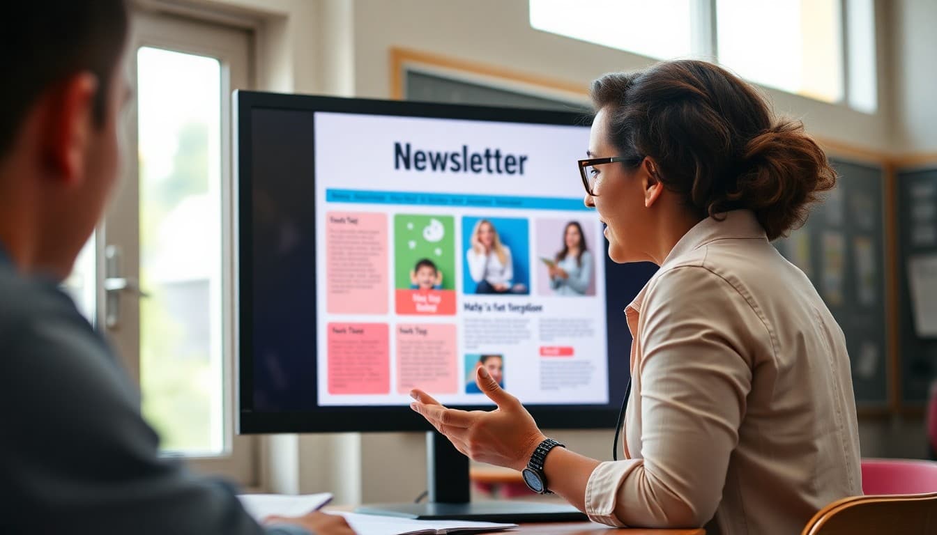
Building a newsletter template from scratch in a general-purpose email tool is time-consuming and produces unreliable results across email clients. Building it in a dedicated newsletter platform like Daystage is faster, produces more consistent results, and does not require CSS or HTML knowledge. Daystage gives you section blocks, image blocks, button blocks, and typography controls that work together to produce a formatted newsletter without design expertise. Once your template is built in Daystage, every subsequent newsletter starts from that template and you only need to update the content rather than rebuilding the structure each time.
Get one newsletter idea every week.
Free. For teachers. No spam.
Frequently asked questions
What makes a good school newsletter template?
A good template has a clear visual hierarchy so readers know where to look first, consistent section headers that families recognize across issues, enough white space so content does not feel dense, and a header that identifies the school and issue clearly. It should also load well on mobile since more than half of newsletter opens happen on phones.
How many sections should a school newsletter have?
Three to six sections is the practical range for most school newsletters. Fewer than three and the newsletter may not justify the send. More than six and families start skimming without reading. Each section should cover one clear topic. If you have ten items to share, consider whether some belong in a different communication channel or could be combined.
Should school newsletters use photos?
Yes, one well-chosen photo per newsletter significantly increases family engagement and read time. Photos of students at school events, classroom activities, or staff introductions perform well. Make sure you have consent for any student photos used. Alt text descriptions on images make the newsletter accessible to families using screen readers and ensure the message reaches families with images disabled in their email client.
How should schools handle branding in newsletter templates?
Use your school colors and logo consistently in the header. Keep fonts to one or two: a header font and a body font. Avoid using school colors for body text, which reduces readability. A simple, consistent brand application makes newsletters look professional without requiring a graphic design background to execute.
Does Daystage provide newsletter templates for schools?
Yes. Daystage gives schools a template-based newsletter builder with sections, headers, image blocks, and formatting that produces professional results without design experience. Teachers and administrators build newsletters that look as polished as professionally designed communications in a fraction of the time.

Adi Ackerman
Author
Adi Ackerman is a former classroom teacher and curriculum writer with 8 years in K-8 schools. She writes about school communication, parent engagement, and what actually works in real classrooms.
More for Technology
Ready to send your first newsletter?
3 newsletters free. No credit card. First one ready in under 5 minutes.
Get started free