

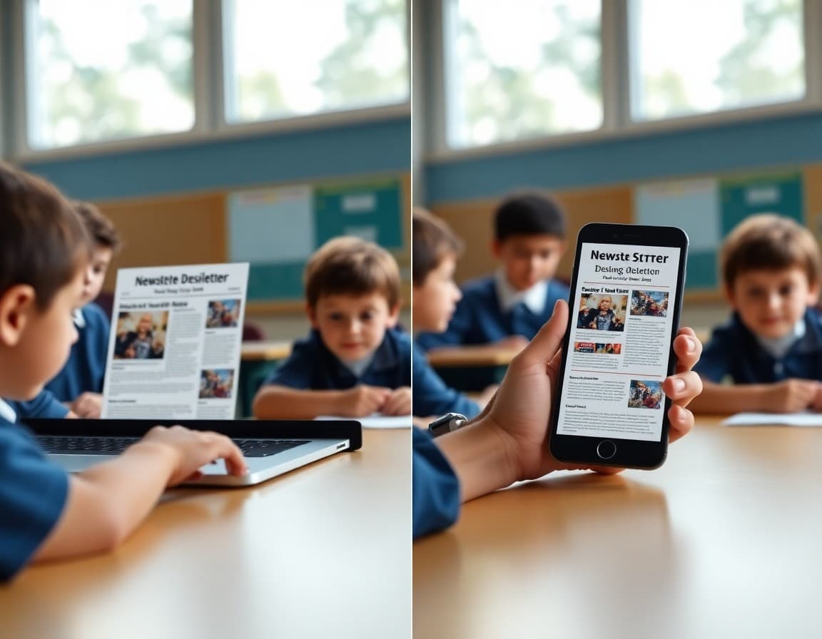
School Newsletter Mobile Preview: How to Test Before You Send
A school newsletter that took forty-five minutes to write and looks beautiful in your email composer can be nearly unreadable on the phone of the parent who opens it while waiting for school pickup. The fonts might be too small. A three-column layout might collapse in a way that makes the content order confusing. An image might stretch past the screen edge. These are not minor issues. They are the experience the majority of your families are having when your newsletter arrives in their inbox. Testing mobile preview before sending is a simple habit that protects the investment you made in writing the newsletter in the first place.
The Mobile Reality of School Communication
Most parents who are of school age today are phone-first email readers. They check their email in the morning before the commute, during school pickup in the parking lot, and in the evening before bed. In all three contexts they are on a phone, not a computer. The newsletter you drafted on a laptop will be read in a very different context by the majority of your audience. When you send a test copy to yourself and open it on your phone, you immediately see what that experience is like. If you would not want to read it that way yourself, your families are having the same reaction but without the context of knowing how the desktop version looks.
Single-Column vs. Multi-Column Layouts
Multi-column layouts can look organized and efficient on a desktop screen. On a mobile screen, they often collapse in ways that reorder content unexpectedly or become too narrow to read comfortably. A two-column layout where an event description is on the left and a photo is on the right might collapse on mobile to show the photo first, then the description below it, which reverses the intended reading order. Single-column layouts avoid this problem entirely. The content reads top to bottom in the same order on every device. For mobile-heavy audiences, single-column is almost always the safer and more effective choice even if it looks less visually dynamic on desktop.
Text Size and Tap Target Size
The two most common mobile usability problems in school newsletters are body text that requires zooming to read and link tap targets that are too small to hit reliably with a finger. Body text should be at least 14 to 16 points on mobile, which means using that size in your newsletter template since mobile may render slightly smaller than the set point size. Links and buttons need to have enough surrounding space that a finger tap hits the right target. When two links appear too close together, such as two paragraph-embedded links three lines apart, families frequently tap the wrong one and get frustrated. Spacing out calls to action and using larger button elements for primary actions fixes both problems.
Image Handling on Mobile
Images in school newsletters can create two types of mobile problems. An oversized image may extend beyond the screen width, forcing families to scroll horizontally to see the whole thing, which is a disorienting experience in an email context. An image with small text overlaid on it becomes unreadable on mobile where the image is scaled down. The best practice for newsletter images is to keep the content of the image itself legible at small sizes and to avoid overlaying text on images entirely since that text is not accessible to screen readers and often becomes unreadable when the image scales. Use image alt text for every image so families whose email clients have images disabled still get the information.
Testing Across Multiple Devices
Different phones render emails differently. An iPhone with Apple Mail may display your newsletter differently than an Android phone using Gmail. The differences are usually minor but occasionally significant, particularly around font rendering, image sizing, and button display. If you or a colleague own phones running different operating systems, testing on both before a major newsletter send takes five minutes and catches the most common cross-device issues. For newsletters that go to large community lists, this extra test is worth the time. Most newsletter platforms including Daystage render using responsive email templates that handle the major cross-device variations automatically, which reduces but does not eliminate the value of device testing.
Building the Test Into Your Workflow
The best way to make mobile testing a habit is to make it a required step before sending rather than an optional check when you have time. Build "send test to phone and review" into your newsletter workflow checklist so it happens every time rather than some times. The review takes less than two minutes. You open the test email on your phone, scroll through it, tap one link to verify it goes to the right place, and confirm the text is readable without zooming. If everything looks good, you send. If something is off, you fix it before it goes to 500 families. This two-minute step prevents the most avoidable mobile experience problems from reaching your community.
Get one newsletter idea every week.
Free. For teachers. No spam.
Frequently asked questions
How many families open school newsletters on mobile?
Industry data consistently shows 55 to 65 percent of email opens happen on mobile devices. For school newsletters, this percentage is often higher since many parents check email on their phones during commutes, school pickup, or in the evening. Designing and testing your newsletter for mobile is not an edge case accommodation. It is designing for the majority of your audience.
What are the most common mobile display problems in school newsletters?
The most common issues are text that is too small to read without zooming (below 14 points for body text), buttons that are too small to tap reliably, images that extend beyond the screen width causing horizontal scrolling, multi-column layouts that collapse in ways that make content order confusing, and links spaced too closely together making it hard to tap the right one.
How do you test a school newsletter on mobile before sending?
The simplest test is to send a test copy to yourself and open it on your phone. Most newsletter platforms including Daystage have a preview function that shows you how the newsletter looks on mobile before you send. Test with your screen brightness at normal levels in a realistically lit room, not in ideal conditions, to see what most families will actually experience.
What font size should school newsletters use for mobile?
Body text should be at least 14 to 16 points. Section headers should be 18 to 22 points. Smaller text is readable on desktop but requires uncomfortable zooming on mobile. When in doubt, err on the side of slightly larger text. Most newsletter content benefits from the readability improvement that slightly larger text provides even on desktop.
How does Daystage ensure school newsletters look good on mobile?
Daystage newsletters are built with mobile-responsive templates that automatically adjust layout for smaller screens. This means single-column formatting on mobile, appropriate text sizes, and tap-friendly buttons are handled by the platform rather than requiring manual design work from each school communicator.

Adi Ackerman
Author
Adi Ackerman is a former classroom teacher and curriculum writer with 8 years in K-8 schools. She writes about school communication, parent engagement, and what actually works in real classrooms.
More for Technology
Ready to send your first newsletter?
3 newsletters free. No credit card. First one ready in under 5 minutes.
Get started free