

School Newsletter Accessibility Checklist: Reach Every Family Equitably
School newsletters are sent to every family, which means they need to be readable by every family. That includes parents who use screen readers, families whose primary language is Spanish or Vietnamese or Arabic, parents with dyslexia or cognitive differences that affect how they process dense text, and anyone reading on a low-quality screen or with poor eyesight. Accessibility in school newsletters is not a niche accommodation. It is the design standard that makes your communication genuinely inclusive rather than accidentally exclusive.
Heading Structure: Navigation for Screen Readers
Screen readers navigate HTML documents using heading structure. A newsletter with properly structured H1, H2, and H3 headings gives screen reader users the ability to jump between sections quickly, understand the hierarchy of content, and navigate to the section that is most relevant to them without listening to the entire newsletter in sequence. A newsletter that uses only paragraph tags with bolded text to create visual headings looks the same to a sighted reader but is completely flat to a screen reader, requiring the reader to listen through the entire content. Most newsletter platforms apply proper heading tags through the interface. Daystage uses structured section headers that export with appropriate heading tags.
Color Contrast: Are Your Colors Actually Readable?
Low color contrast between text and background is one of the most common accessibility failures in newsletters, including school newsletters. Many schools use their brand colors for decorative text elements without checking whether those colors have sufficient contrast against their backgrounds. A medium-blue text on a light blue background might look beautiful to a fully-sighted reader in good lighting but be nearly unreadable to anyone with low vision or color vision deficiency. The WCAG 2.1 standard sets a minimum contrast ratio of 4.5:1 for normal text. Free tools like the WebAIM Color Contrast Checker let you enter two hex codes and immediately see the contrast ratio and whether it passes WCAG standards. Check any text color combinations you use regularly against this tool.
Font Size and Legibility
Text smaller than 14 points creates reading difficulty for families with lower vision, older parents, and families reading on small screens. Many school newsletters default to the email template font size, which is often 12 points because that is a common document standard. For email newsletters, 14 to 16 points for body text and 18 to 22 points for section headers is more appropriate. The difference in accessibility impact is significant. The difference in newsletter appearance is minimal. Increasing your template font size by two points is one of the lowest-effort, highest-impact accessibility changes you can make.
Plain Language and Reading Level
Cognitive accessibility means designing for the range of reading abilities in your community. Many families in school communities are reading at or below a sixth-grade level. Educational jargon, complex sentence structures, and dense paragraphs create genuine comprehension barriers for these families. The Flesch-Kincaid readability test or tools like Hemingway Editor can show you the reading level of your newsletter text. Aim for a sixth to eighth grade reading level for general family newsletters. Use short sentences with one idea each. Define acronyms on first use. Break content into short paragraphs with clear headers. These practices improve comprehension for every reader, including highly educated ones who are reading quickly on their phone.
Link Descriptions That Make Sense Out of Context
Screen reader users often navigate by jumping between links in a document. When every link reads as "click here" or "learn more," the screen reader user has no way to know what each link leads to without reading the surrounding context. Descriptive link text that works out of context, such as "download the spring field trip permission form" or "register for the April 22nd science fair" serves both accessibility and usability for all readers. It also tends to improve click-through rates for sighted readers because the link clearly describes the value of clicking.
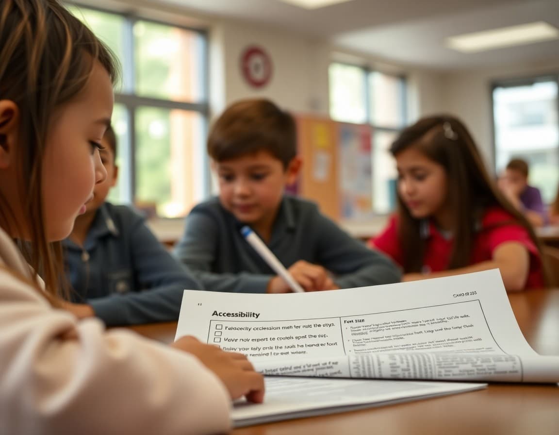
The Accessibility Checklist
Before sending any school newsletter, run through these checks: Does every image have a descriptive alt text? Are all section headers marked as headers rather than just bolded text? Is body text at least 14 points? Do all text-background color combinations pass a 4.5:1 contrast check? Are all links described in terms of what they lead to rather than "click here"? Is the language written at a sixth to eighth grade reading level? Is there a plain text version available for families who cannot load HTML email? Is the newsletter single-column for mobile readability? This checklist takes less than five minutes to review before sending and catches the vast majority of accessibility issues before they affect your families.
Get one newsletter idea every week.
Free. For teachers. No spam.
Frequently asked questions
Why does email accessibility matter for school newsletters?
Schools serve families with visual impairments who use screen readers, families with cognitive differences that affect how they process dense text, and families whose first language is not English. An accessible newsletter reaches these families as effectively as everyone else. It is also increasingly expected: Section 508 and ADA accessibility standards apply to school communications at publicly funded schools.
What is the most impactful single accessibility change for school newsletters?
Adding descriptive alt text to every image is the highest-impact single change because it serves multiple groups simultaneously: families using screen readers hear the description of the image, families with images disabled in their email client see the alt text instead of a broken image icon, and families on slow connections who have not loaded images still understand the newsletter's visual content.
What color contrast ratio should school newsletters use?
WCAG 2.1 guidelines recommend a contrast ratio of at least 4.5:1 for normal text and 3:1 for large text. Most dark text on white backgrounds easily meets this standard. Problems usually occur with light-colored text on slightly light backgrounds, colored text on colored backgrounds, or text on images where the underlying image color varies. Use a color contrast checker tool to verify any combination you are unsure about.
How should school newsletters handle families with low reading levels or cognitive differences?
Write at a sixth to eighth grade reading level using short sentences, common vocabulary, and clear structure with section headers. Avoid jargon, acronyms without explanation, and long complex paragraphs. Break content into short sections with clear headers so readers can skip to what is relevant to them. These practices improve comprehension for all readers, not just those with specific differences.
Does Daystage support accessible newsletter design for schools?
Daystage provides structured newsletter templates with proper heading hierarchy and section organization that supports screen reader navigation. The platform's image blocks include alt text fields so every image in your newsletter can have a descriptive text alternative. Building accessibility into the template means it is easier to be consistent across issues.

Adi Ackerman
Author
Adi Ackerman is a former classroom teacher and curriculum writer with 8 years in K-8 schools. She writes about school communication, parent engagement, and what actually works in real classrooms.
More for Technology
Ready to send your first newsletter?
3 newsletters free. No credit card. First one ready in under 5 minutes.
Get started free