
School Newsletter Layout Guide: Structure That Helps Families Actually Read It
The layout of your school newsletter affects whether families read it, how much they read, and what they remember. A newsletter with great content but poor layout gets skimmed or abandoned. A newsletter with a clean, consistent layout gets read in full more often than one that looks different every month or is hard to navigate on a phone.
Mobile-first layout: the starting point
The majority of families open school emails on a smartphone. Your newsletter must be readable on a 5- to 6-inch screen before you worry about how it looks on desktop.
Two layout rules that make the biggest difference on mobile:
- Single column only. Two-column layouts often render stacked on mobile, making the visual hierarchy completely different from what you designed. Single-column layouts look the same on every device.
- Minimum 14px font for all body text. Anything smaller requires pinch-to-zoom, and families who have to zoom in to read your newsletter will not finish it.
Section structure and visual hierarchy
Every section of your newsletter should be visually distinct from the ones around it. The tools for creating that distinction:
- Bold section headers in a larger font. H2 level, consistent style across every section. Families scanning the newsletter navigate by these headers.
- White space between sections. A horizontal rule, extra padding, or both. Section breaks that are too subtle get missed.
- Short paragraphs. Two to four sentences maximum per paragraph in the body sections. Dense paragraphs get skipped.
Branding: consistent, not overdesigned
Your school's colors and logo belong in the newsletter header and possibly in section headers. Beyond that, restraint is usually better. A newsletter that uses the school's blue for headers and dividers looks polished and professional. A newsletter with four colors, multiple font styles, and clip art looks like it was designed by committee on a Friday afternoon.
Set your branding once and do not touch it. Every subsequent newsletter should look like it came from the same place.
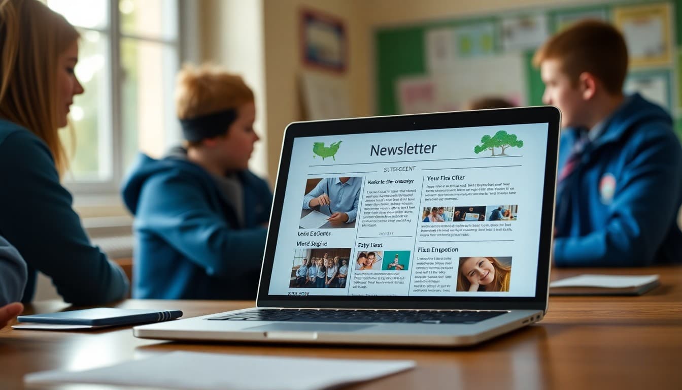
How to handle images in the layout
Images placed between sections, at full content width, work better in newsletters than images floated next to text. Text-wrap layouts that look good on desktop often produce awkward results on mobile where the text and image do not flow as expected.
One or two full-width images, placed at natural section breaks, is the most reliable approach. Each image needs alt text. Keep image files under 200KB for fast load times.
The header and footer
The header should include your school's logo, the newsletter name (or just the date), and ideally a brief 'Newsletter from Principal [Name]' line so families immediately know where this came from.
The footer should include: the school address, a contact email, and an unsubscribe option (required by email regulations in most contexts). The footer is also a good place for a brief 'Questions? Reach us at [number]' line.
Consistency across months matters more than perfection
A perfectly designed newsletter that looks different every month is less effective than a simple, consistent layout that families recognize immediately. The goal is for families to see your newsletter in their inbox and know exactly what to look for and where to find it.
Daystage gives principals a fixed template with school branding built in. You update the content, and the layout stays consistent across every send. That consistency is what builds readership over time.
Get one newsletter idea every week.
Free. For teachers. No spam.
Frequently asked questions
What is the ideal layout for a principal school newsletter?
A single-column layout with a clear header, distinct section breaks with bold headings, short paragraphs of two to four sentences, and bulleted lists for event dates and action items. Two-column layouts look organized on desktop but often break on mobile, where most families are reading. Single-column always works across devices.
How wide should a school newsletter be?
Between 500 and 700 pixels wide. Wider than 700px breaks on many mobile screens. Narrower than 500px can feel cramped on desktop. Most email newsletter tools default to 600px, which is the standard for a reason.
Should I use color in a school newsletter layout?
Yes, but strategically. Use your school's primary color for section headers or dividers to create visual hierarchy. Avoid using multiple bright colors in the body text, which is hard to read and looks busy. Background colors should have sufficient contrast with text. Dark text on white or very light backgrounds is always the safest choice for readability.
How do I make a newsletter layout scannable?
Clear section headers in a larger or bolder font than body text. Short paragraphs with white space between them. Bulleted lists for multi-item information. Bold key dates or action items within paragraphs. A family who spends 20 seconds scanning should be able to identify the most important item in each section before reading a full sentence.
What tool helps principals send newsletters efficiently?
Daystage provides a newsletter layout built specifically for school communication: single-column, mobile-responsive, school-branded, and consistent across email clients without requiring any CSS or design expertise from the principal.

Adi Ackerman
Author
Adi Ackerman is a former classroom teacher and curriculum writer with 8 years in K-8 schools. She writes about school communication, parent engagement, and what actually works in real classrooms.
More for Principals
Ready to send your first newsletter?
3 newsletters free. No credit card. First one ready in under 5 minutes.
Get started free