
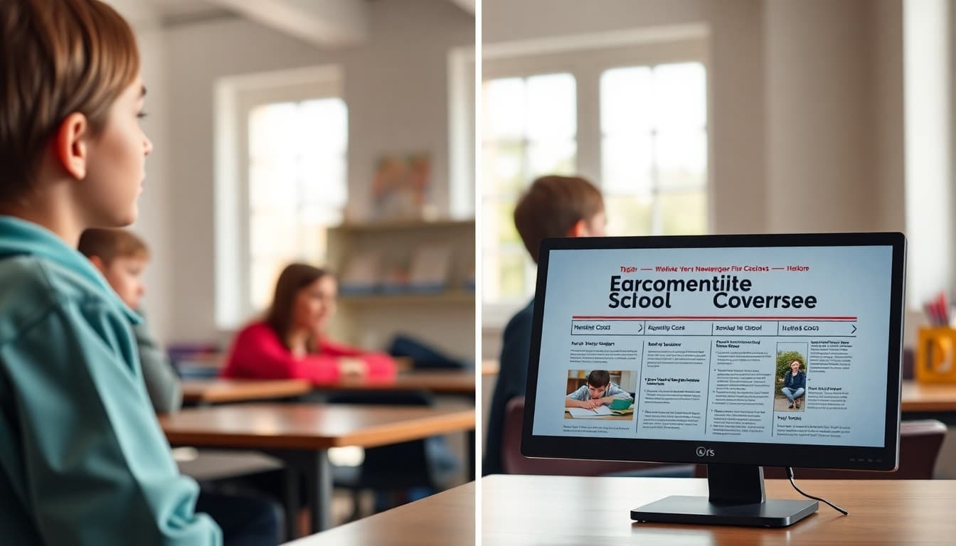
How to Design a School Newsletter Header That Stands Out

The header of your school newsletter is the first thing families see every week. When it is done well, they recognize it instantly in a crowded inbox and know immediately what is inside. When it is done poorly, it either looks like an advertisement or fails to identify the school at all. Here is what makes a school newsletter header effective.
The Job of a Newsletter Header
A school newsletter header has one primary job: tell the reader immediately who sent this and that it is worth reading. Everything else in the header serves that job or should be removed. A header with the school name, logo, and a clear newsletter title accomplishes this in under two seconds. A header with a large decorative image, animated graphics, eight lines of contact information, and a motivational quote accomplishes it in none.
Essential Elements Only
Required elements: school name (or logo containing the name), newsletter title or identifier, and issue date or date range. Optional elements that add value without clutter: school website URL, main office phone number, and a newsletter volume or issue number if your school tracks those.
Elements that do not belong in the header: staff spotlights, event callouts, announcements of any kind, and motivational quotes. Those belong in the body. The header is identification, not content.
Mobile Header Height Matters
Most school newsletters are opened on phones. A header that looks proportional on a 27-inch monitor takes up the entire screen of a phone before the reader has seen a single piece of content. Test your header on a phone before finalizing it. If the first useful content requires scrolling, the header is too tall.
A practical rule: on a standard phone screen (375px wide by 812px tall), the header should take up no more than 20 to 25 percent of the visible area. For most designs, this means a header between 80 and 150 pixels tall works well. Anything taller than 200 pixels consistently hurts engagement.
Logo Placement and Size
The school logo should be immediately visible and legible, not tiny in a corner or so large it crowds out the newsletter title. A logo that is too small (under 80 pixels wide) is illegible on mobile. A logo that is too large (over half the header width) overwhelms the other header elements.
Common placement patterns that work: logo centered at top with school name below, logo left-aligned with school name and newsletter title to the right, logo right-aligned as a secondary element with school name as the primary heading. All three are effective; pick one and use it consistently.
Using School Colors Effectively
The header is the right place to apply your school's brand colors because it creates recognition without affecting the readability of the body text. A header in your school's blue with white text for the school name is clear, branded, and effective. The key is ensuring the text in the header meets contrast requirements even on the brand-colored background. Dark backgrounds with white text and light backgrounds with dark text both work if the contrast ratio is sufficient.
Template: A Clean School Newsletter Header Structure
Here is the structure of a header that works in most contexts:
[School Logo, centered, 100-120px tall] [School Name, 22px bold, school primary color or white if on dark background] [Newsletter Title: "Weekly Family Update" or similar, 16px, secondary color or lighter weight] [Issue date or date range, 13px, muted color] [Thin rule or color block separating header from body]
Total height on mobile: approximately 140-160 pixels. First content visible without scrolling.
Consistency Builds Recognition
Families who see the same header structure every week build recognition in the same way they recognize a familiar magazine masthead. The header becomes a signal that this is the school newsletter and it is worth opening. Changing the header frequently undermines that recognition. Seasonal updates, like changing a background photo from fall to winter, are fine. Redesigning the header structure each month is not.
What to Do If Your School Has No Logo
Many elementary and smaller schools do not have a formal logo. A text-based header using a clean, consistent font is completely appropriate. The school name in a large, legible typeface with your school's colors applied is a perfectly functional newsletter header. A wordmark, which is just the school name set in a distinctive but readable typeface, serves the same purpose as a logo for header recognition purposes.
Get one newsletter idea every week.
Free. For teachers. No spam.
Frequently asked questions
What should a school newsletter header include?
At minimum: the school name or logo, the newsletter title or volume and issue number, and the publication date or date range. Some headers also include the school's contact information, website, or a brief tagline. Keep it to the essential information that identifies the source immediately. A header that requires reading carefully to identify the school is not doing its job.
How tall should a school newsletter header be?
For email newsletters, the header should be tall enough to be recognizable and no taller. On mobile, every pixel of header height is content that families have to scroll past before reaching anything useful. A header between 80 and 150 pixels tall works well for most designs. Headers that exceed 200 pixels on mobile push the first piece of content off screen, which reduces engagement significantly.
Should every newsletter have the same header or should it change?
The core header elements should stay consistent: school name, logo placement, and color scheme. What can vary seasonally or periodically: a background photo or illustration, a subtitle or theme for the specific issue, and featured section labels. Consistency in the brand elements builds recognition; some variability in supporting elements keeps the newsletter feeling current.
What file format is best for school logo in a newsletter header?
PNG with a transparent background is the best format for logos in email newsletters. PNG preserves sharp edges and supports transparency, so the logo works correctly against any background color. Avoid JPEG for logos because JPEG compression introduces artifacts around text and sharp edges, making logos look blurry or pixelated. SVG is ideal for web but is not reliably supported in email clients.
What newsletter platform makes it easy to create professional school newsletter headers?
Daystage includes a built-in header design system specifically for schools. You upload your school logo, select your colors, and the platform generates a consistent header that works across email clients and mobile screens. You do not need design software or coding knowledge, and the output looks professional because it is built on templates tested across major email clients.

Adi Ackerman
Author
Adi Ackerman is a former classroom teacher and curriculum writer with 8 years in K-8 schools. She writes about school communication, parent engagement, and what actually works in real classrooms.
More for Guides
Ready to send your first newsletter?
3 newsletters free. No credit card. First one ready in under 5 minutes.
Get started free