
School Newsletter Color Choices That Keep Parents Reading

Color choices in a school newsletter affect whether families read it, whether it feels trustworthy, and whether everyone in your community can actually see it clearly. Most schools approach newsletter color with one of two methods: no thought at all, or too much thought that produces something busy and hard to navigate. Here is a practical framework for getting it right.
Start With Accessibility, Not Aesthetics
Before any other consideration, the text in your newsletter needs to be readable by everyone in your community. This means meeting contrast standards. The WCAG minimum contrast ratio for body text is 4.5:1 between text and background. This ratio is not arbitrary; it is calibrated to ensure readability for people with reduced contrast sensitivity, color blindness, or visual impairment.
Testing your color choices is simple. Tools like the WebAIM Contrast Checker (webaim.org/resources/contrastchecker) let you enter any two color codes and immediately see the contrast ratio. Black (#000000) on white (#FFFFFF) is 21:1, far above the minimum. Medium gray on white often fails. Check before you commit.
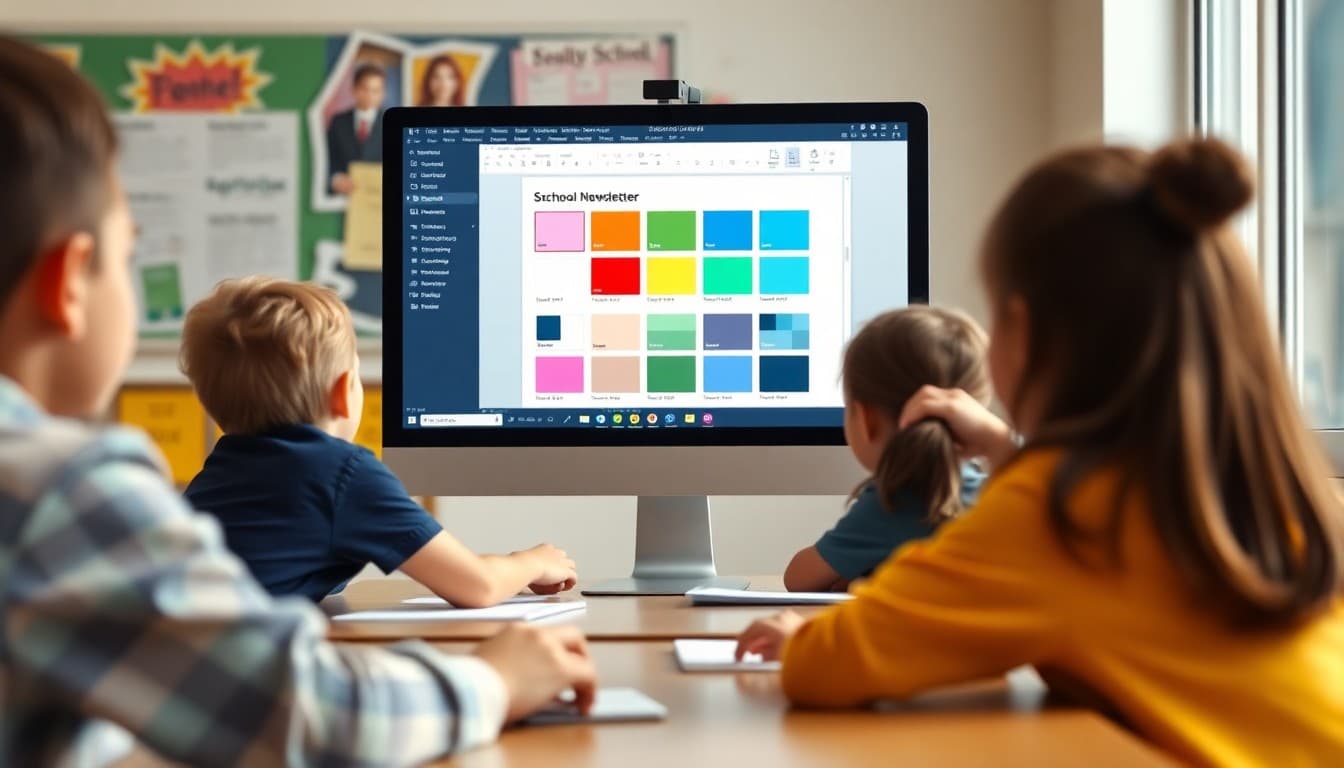
The Three-Color Rule
Most school newsletters perform best with a three-color palette: one primary brand color, one accent color, and a neutral text color (black or very dark gray). The primary brand color, typically derived from the school's official palette, appears in the header, section headings, and borders. The accent color appears in buttons, links, and highlighted call-to-action areas. The text color is used for all body text throughout.
Adding more colors does not make a newsletter more visually engaging; it creates inconsistency that reads as unprofessional. Fewer, well-chosen colors used consistently produce newsletters that look intentional.
How to Use Your School Colors
School colors provide a ready-made starting point for newsletter branding. A header using your school's blue, a button in the school's gold, and black body text on white is a complete, consistent palette. The challenge arises when school colors include light or low-contrast tones that do not meet readability standards when used for text or backgrounds.
If your school colors include a light color like light yellow or light sky blue, use those colors as background elements only, never for text or on text that needs to be readable. Reserve darker versions of your school colors for any text or interactive elements.
Body Text Is Always Dark on Light
This is the rule with the fewest exceptions for email newsletters: body text is always dark (black or very dark gray) on a light (white or very light) background. Reversed text, light text on a dark background, can work for headlines and short callouts but is significantly harder to read for extended text. A newsletter section where the body text is white on navy blue might look striking on a design mockup and be genuinely difficult to read for a portion of your audience.
Every time you are tempted to put body text on a colored background for visual interest, replace that with a colored header above a white content section instead. You get the visual variety without the readability cost.
Template Color Scheme Example
Here is a practical school newsletter color scheme that works for a school with blue and gold colors:
Header background: School blue (#1a3a6b). Header text: White (#FFFFFF). Body background: White (#FFFFFF). Body text: Near-black (#1a1a1a). Section heading text: School blue (#1a3a6b). Button background: School gold (#d4a100). Button text: Black (#000000). Section divider line: Light gray (#e0e0e0). Link color: School blue (#1a3a6b), underlined.
This scheme uses school colors for brand recognition while keeping all extended text in high-contrast dark-on-white combinations.
Link Colors and Underlines
Links should be visually distinct from surrounding text. Underlined links in your primary brand color are the clearest approach. Avoid removing underlines from links for aesthetic reasons; underlines are accessibility signals that help screen reader users identify clickable text. Also avoid using a link color that is too similar to your body text color; if parents cannot immediately identify what is clickable, click rates will suffer.
Color Blindness and Your Newsletter
Approximately 1 in 12 men and 1 in 200 women have some form of color vision deficiency, most commonly red-green color blindness. If you rely on color alone to convey information in your newsletter, such as "items in green are complete and items in red require action," that message will be lost for a portion of your audience. Always pair color signals with text labels or icons so the information is conveyed in more than one channel.
Get one newsletter idea every week.
Free. For teachers. No spam.
Frequently asked questions
How many colors should a school newsletter use?
Three colors at most: a primary brand color (typically the school's main color), a secondary accent color used sparingly for buttons or highlighted sections, and black or very dark gray for all body text. More than three colors creates visual noise and reduces the readability and professionalism of the newsletter. Constraint in color choices is not a limitation; it is what makes a newsletter feel consistent and intentional.
What text-to-background color combinations work best in school newsletters?
Dark text on a light background is the most readable combination for extended reading and meets accessibility standards. Black or very dark gray on white is the baseline. School color variations that maintain adequate contrast, such as dark navy text on a light cream background or dark forest green text on white, can work if the contrast ratio is sufficient. Avoid light text on colored backgrounds for anything longer than a headline.
What is color contrast accessibility and why does it matter for school newsletters?
Color contrast accessibility refers to the ratio between the lightness of text and its background. The Web Content Accessibility Guidelines (WCAG) require a minimum contrast ratio of 4.5:1 for normal text and 3:1 for large text. This matters because approximately 8 percent of men and 0.5 percent of women have some form of color vision deficiency, and many more have reduced contrast sensitivity due to age or screen brightness. A school newsletter that does not meet contrast minimums is not fully readable for a portion of your audience.
Should school newsletters use the school's official colors?
Using school colors in the newsletter header and accents is a good practice for brand recognition. Families who see consistent school colors build recognition that helps the newsletter stand out in a crowded inbox. However, school colors should be used selectively, primarily in the header, section dividers, and button colors. They should not override the black-on-white standard for body text readability.
What newsletter platform handles color accessibility for schools automatically?
Daystage uses a curated set of newsletter themes that meet contrast accessibility standards and are tested across email clients. If your school has specific brand colors, you can apply them to the header and accent elements without compromising the readability of the body text. The platform prevents common accessibility mistakes like white text on light backgrounds.

Adi Ackerman
Author
Adi Ackerman is a former classroom teacher and curriculum writer with 8 years in K-8 schools. She writes about school communication, parent engagement, and what actually works in real classrooms.
More for Guides
Ready to send your first newsletter?
3 newsletters free. No credit card. First one ready in under 5 minutes.
Get started free