
Data Visualization in School Newsletters: Charts and Infographics That Work

School data exists in abundance. Most of it never reaches families in a form they can understand or use. Data visualization in your newsletter changes that. A well-designed chart turns an abstract statistic into something families can see and respond to, which makes your communication more credible and your community more engaged in outcomes that matter.
Why Families Respond to Data Differently Than Text
A sentence that says "attendance has improved this semester" is easy to read and immediately forgettable. A bar chart showing monthly attendance rates for six months, with the current month noticeably higher than the low point in November, creates a visual memory that stays with the reader. That persistence is why data visualization in newsletters increases both comprehension and retention compared to equivalent text descriptions of the same information.
Choose the Right Chart Type for Your Data
Different data relationships communicate better with different chart types. Use a bar chart when comparing categories side by side, like attendance across grade levels. Use a line chart when showing change over time, like reading fluency scores across months. Use a simple pie chart only when the proportional relationship is the main point and you have no more than four or five segments. Avoid pie charts with many slices and avoid 3D charts, which distort the visual representation of the underlying numbers.
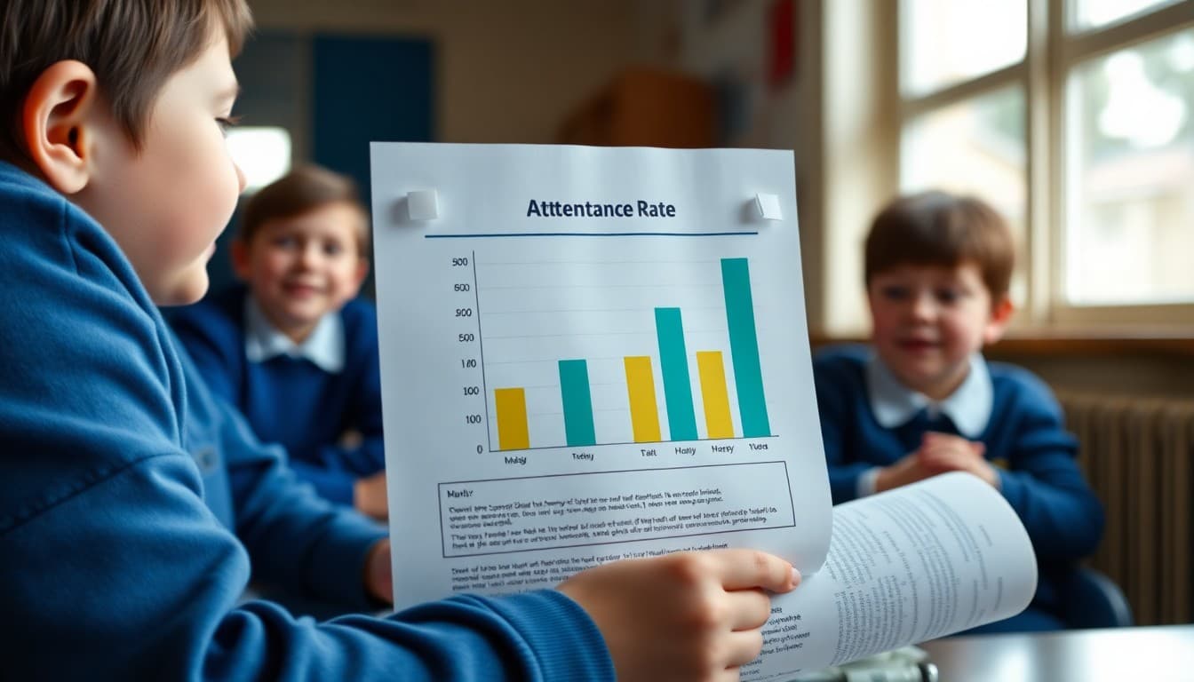
Strip Out Everything That Is Not the Main Point
The default charts produced by spreadsheet software are cluttered. They include gridlines, legends, axis labels, data labels, and sometimes borders and shadows that add visual complexity without adding understanding. Before you export a chart for a newsletter, remove everything that is not essential to communicating the main message. A chart with clean bars, clear axis labels, and a descriptive title is more readable than an elaborate chart with the same underlying data.
Pair Every Data Visualization With One Clear Sentence
A chart without a caption makes the reader do all the interpretive work. A caption that states the main finding removes that work: "Attendance in April was the highest of any month this school year." That sentence tells families what they should notice and allows them to look at the chart as confirmation rather than puzzle. The combination of chart and caption is faster to understand than either one alone.
Use Comparison to Create Context
A single data point without context is almost always misleading. Thirty-seven percent chronic absence rate is alarming without knowing that the same rate was 45 percent last year. Show comparisons wherever possible: this year versus last year, this month versus the same month previously, your school versus the district average. Comparison transforms a number from a fact into a story, which is what actually changes how families think and act.
Represent Data Honestly
Truncating the y-axis of a bar chart so that a small improvement looks dramatic, or choosing a time window that happens to show a favorable trend while hiding a longer-term decline, are common data visualization errors that erode trust when families notice them. Present data at full scale, acknowledge where trends are not moving in the right direction, and pair difficult data with honest explanations of what the school is doing about it. Families who see honest data, including unflattering data, trust the communication more than those who only see good news.
Test the Visualization on a Phone Before Sending
Data visualizations that look clear on a desktop often become tiny and unreadable on a phone. Before including any chart or infographic in a newsletter, send a test email and open it on the smallest screen you have access to. If you need to zoom to read the labels, simplify the chart further. A chart with three data points and large text is more useful than a comprehensive chart that requires a magnifying glass. Daystage resizes images automatically for mobile, but the content inside the image still needs to be readable at smaller sizes.
Get one newsletter idea every week.
Free. For teachers. No spam.
Frequently asked questions
What types of school data work best as newsletter visualizations?
Attendance trends over time, reading benchmark progress across a semester, survey results comparing current and previous years, program participation rates, and simple before-and-after comparisons. Any data that has a direction (improving, declining, stable) communicates well visually. Data that is primarily a snapshot without context tends to need more explanation than a simple visual provides.
What free tools can I use to create data visualizations for a school newsletter?
Google Sheets and Excel both produce chart images you can export and insert into a newsletter. Canva has a free chart tool that produces visually polished results without design skills. Infogram and Datawrapper are more specialized tools that produce clean, embeddable charts. For most school newsletter purposes, Google Sheets exported as a PNG image is sufficient and takes about five minutes.
How do I simplify complex data so it is readable in a newsletter?
Remove everything that does not directly support the point you are making. A chart showing attendance for each of the 180 school days in a year is unreadable. A chart showing average attendance by month, eight to nine data points, is clear. The rule is: if a reader cannot understand the main message of the chart in five seconds, the chart has too much in it.
What should I avoid when including data in a school newsletter?
Avoid using raw numbers without context. A 73 percent attendance rate means nothing without knowing whether that is better or worse than last year, what the target is, or how it compares to peer schools. Avoid using data to shame or alarm without pairing it with a clear response plan. And avoid precise decimal places that imply more certainty than the underlying data warrants.
How does Daystage support inserting data visualizations into school newsletters?
Daystage lets you insert images directly into your newsletter layout, so any chart or infographic you create externally can be dropped in cleanly. The editor handles resizing for different screen sizes automatically. You can also use the text formatting tools to present simple data comparisons as structured text when a full chart is not necessary.

Adi Ackerman
Author
Adi Ackerman is a former classroom teacher and curriculum writer with 8 years in K-8 schools. She writes about school communication, parent engagement, and what actually works in real classrooms.
More for Guides
Ready to send your first newsletter?
3 newsletters free. No credit card. First one ready in under 5 minutes.
Get started free