
Teacher Newsletter Format: Structure That Families Actually Read

Format is what determines whether your newsletter gets read or gets scrolled past. Content matters, but a well-written newsletter buried in a wall of unformatted text will still miss families. Structure your newsletter so the most important things are easy to find, and families will come back to it reliably every week.
Start With What Families Need to Act On
Put upcoming dates, deadlines, and action items near the top of your newsletter. Not after the warm greeting or the classroom update. Right at the top, in a visible section. "Upcoming dates: Oct 7 permission slip due. Oct 10 class picture day. Oct 14 no school." Families who only read the first section of your newsletter will have caught the things they need to act on. Everything else is context.
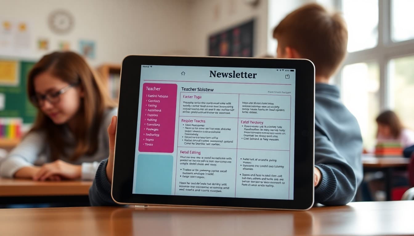
Use Section Headers Consistently
Headers do the work of telling families where they are in your newsletter. "Upcoming Dates," "What We Are Learning," "Reminders," and "From the Teacher" are all clear, functional headers. They also help families who come back to reference something find it quickly. A newsletter without headers requires re-reading to find a specific piece of information. A newsletter with headers can be scanned in ten seconds.
Keep Each Section Focused
Each section should cover one topic only. Do not combine dates and curriculum updates in the same section. Do not put a reminders and a heartfelt reflection in the same paragraph. When a section covers two different things, families are not sure where to look or how to file the information mentally. One topic per section, clearly labeled.
Limit Your Section Count
Three to five sections is the right range for a weekly newsletter. If you have six sections, two of them probably do not need to be there. Common choices: Upcoming Dates, Learning Update, Action Items, and Optional Extra such as a student spotlight, resource link, or photo. Everything else should either be folded into one of those sections or cut entirely.
Design for Phone Reading
Most families read your newsletter on a phone, often in a rushed moment. Single-column layouts with large enough text, clear section breaks, and short paragraphs work better on a phone than two-column dense designs. If you are sending a formatted newsletter, preview it on your own phone before it goes out. If you cannot scan the key information in thirty seconds on the phone view, restructure before sending.
Consistent Format Every Week
One of the most underrated parts of newsletter format is consistency. When families know your newsletter always has dates at the top and reminders in the third section, they read faster and retain more. A format that changes every week requires families to re-orient each time. Consistency is what turns a newsletter into a habit for the families who receive it.
End With One Clear Close
Your closing section should be brief and direct. A thank-you for reading, a note on how to reach you, or a simple sign-off. Two or three sentences maximum. Some teachers add a student quote or a learning highlight here. That works well if it is consistent. What does not work is a closing that meanders through multiple topics because everything else ran out of room at the top.
Get one newsletter idea every week.
Free. For teachers. No spam.
Frequently asked questions
What is the best format for a teacher newsletter?
A consistent structure with clearly labeled sections works best: a brief intro or greeting, upcoming dates near the top, a curriculum or learning update, action items or reminders, and a short closing. Families who know where to find information in your newsletter will open it every week.
Should important dates go at the top or bottom of the newsletter?
Top. Families scan for dates first because they need to plan around them. If a permission slip deadline or test date is buried in the middle of a paragraph, families miss it. Put dates in a clearly visible section near the top, ideally in a list or table.
How many sections should a teacher newsletter have?
Three to five sections is the right range for a weekly newsletter. More than five and it starts to feel overwhelming. Fewer than three and you may be missing something. Common sections: dates, classroom update, action needed, and optional extras like a student spotlight or resource link.
Should teacher newsletters use headers and bullet points?
Yes. Headers make sections scannable. Bullet points make lists of dates and action items readable at a glance. A newsletter that is all continuous paragraphs is harder to navigate on a phone, and most families read your newsletter on a phone.
Does Daystage offer a newsletter format that works well for teachers?
Yes. Daystage is built around block-based newsletter design, which naturally creates section structure, visual hierarchy, and a readable layout that works on any device. Teachers who switch to Daystage consistently report that families engage more with their newsletters.

Adi Ackerman
Author
Adi Ackerman is a former classroom teacher and curriculum writer with 8 years in K-8 schools. She writes about school communication, parent engagement, and what actually works in real classrooms.
More for Classroom Teachers
Ready to send your first newsletter?
3 newsletters free. No credit card. First one ready in under 5 minutes.
Get started free