

How to Write a Sensory-Friendly School Newsletter
Most school newsletters are not designed with sensory accessibility in mind. They are dense, visually busy, high-contrast, and built for families who process a lot of incoming information easily. For families of children with autism, ADHD, or sensory processing differences, that design can be genuinely overwhelming.
A sensory-friendly newsletter is not a different newsletter. It is a better-designed newsletter. The same changes that make it easier for sensory-sensitive families to read also make it more readable for everyone.
Visual Design: What to Change
Reduce visual clutter
The most common design mistake in school newsletters is treating visual variety as engagement. Multiple fonts, highlighted text, decorative borders, bright background colors, animated GIFs, clashing color schemes. These elements create cognitive load for every reader and genuine distress for some.
Use one font family. Use color sparingly, one accent color, used consistently. Avoid animated elements. Use whitespace generously. The newsletter should look calm before anyone reads a word.
Use high-contrast text without harsh brightness
Black text on a pure white background is technically high contrast but harsh for many readers. Dark gray text on an off-white or very light gray background is easier to read for a longer period and reduces visual fatigue. If you are using a newsletter tool that lets you customize backgrounds, a warm off-white (#fafaf8 or similar) is a small change that makes a real difference.
Keep font sizes readable without requiring effort
Body text at 16px minimum. Headings clearly larger. Do not require readers to zoom or squint. This applies to mobile viewing especially, most families read newsletters on their phones. Test your newsletter on a phone before sending it.
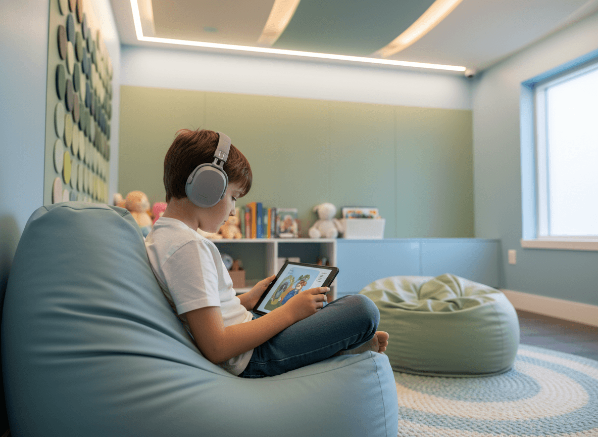
Use images thoughtfully
Classroom photos, if you include them, should not show distressed or overwhelmed students. Candid photos during calm, purposeful activity are appropriate when families have consented to their child's image being shared.
For newsletters shared more broadly, decorative images should be calm and non-stimulating. Nature scenes, simple illustrations, and neutral photography work well. Avoid flashing elements, complex visual scenes, or anything with high visual chaos.
Content: How to Write for Sensory-Sensitive Readers
Use predictable structure, every time
For families of children with autism and sensory processing differences, predictability is not just a nicety, it is a significant source of comfort. When the newsletter always has the same sections in the same order, families know what to expect. The cognitive effort of orienting to a new layout every week is eliminated.
Use the same section headers every issue. Same order. Same approximate length for each section. Vary the content, not the structure.
Prepare families for upcoming changes
Changes to routine are major stressors for many children with sensory and processing differences. A newsletter that names upcoming changes in advance gives families time to prepare their children.
"Next Tuesday is picture day. There will be a photographer in the building and all classes will have their photos taken in the gym between 9am and 11am. The gym will be louder and brighter than usual. If your child has sensory sensitivities around cameras or bright lights, you may want to discuss this with them before Tuesday and share any strategies that help."
This kind of specific, advance notice is the communication these families most value and most rarely receive.
Name sensory elements in activity descriptions
When describing classroom activities, briefly note sensory elements that families should know about. Not every activity needs this, but anything with unusual sounds, textures, smells, or lighting is worth flagging.
"This week we are doing a science experiment with clay and vinegar. It involves hands-on mixing and the vinegar has a strong smell. Students can wear gloves if they prefer, and we will have sensory alternatives available."
Use plain, literal language
Idioms, metaphors, and figurative language create comprehension friction for readers with autism or language processing differences. "We hit it out of the park this week" is harder to process than "This week went really well." Write the way you talk, directly, literally, without idioms that require background knowledge to decode.
Format Choices That Matter
Send the full newsletter as email, not as a link
Newsletter tools that send a link to a web page add a navigation step that increases the chance a family never reads the content. For families already managing significant load, this one extra tap is often the difference between reading and not reading.
When the newsletter renders directly in the email client, families read it. When it requires opening a browser, many do not.
Keep the email subject line literal
"Mr. Torres's Class Newsletter, Week of May 5" is more accessible than "What a Week!" The subject line tells the reader exactly what the email is before they open it. For readers who process best when they know what to expect, this matters.
Keep total length under 400 words
Families managing children with significant needs are often cognitively depleted by the end of the school day. A newsletter they can read in under two minutes will be read. One that requires fifteen minutes of focused attention will be set aside.
This constraint also makes you a better writer. Short newsletters force you to prioritize the information that actually matters.
Get one newsletter idea every week.
Free. For teachers. No spam.
Frequently asked questions
When should schools adopt sensory-friendly formatting for their newsletters?
Adopt sensory-friendly formatting before you receive a complaint, not in response to one. Families of students with sensory processing differences are already managing significant cognitive and sensory load, and a visually overwhelming newsletter adds friction to the most routine school communication they receive.
What should a sensory-friendly school newsletter include in its design?
Use a clean single-column layout, a white or very light background, high-contrast body text (black or near-black on white), a readable sans-serif font at 16px or larger, and minimal decorative elements. Avoid animated GIFs, bold color backgrounds, and multiple competing call-to-action elements in the same visual space.
How should teachers write newsletter content for sensory-sensitive families?
Write short paragraphs with one idea each, use bullet lists for multi-step information, and put the most important information first rather than burying it in the middle. Predictable structure each week is itself a sensory accommodation because families can find what they need without hunting.
What are common design mistakes that make school newsletters hard to process for sensory-sensitive readers?
The most common issues are heavy use of background colors or textures, small justified text with inconsistent word spacing, images placed inside text columns that break reading flow, and subject lines with multiple punctuation marks or all-caps shouting. These elements are easy to add but create real barriers for some families.
How can schools build sensory-friendly newsletter templates without starting from scratch each issue?
A tool like Daystage provides structured block-based templates where the layout constraints are already set. Teachers fill in content rather than redesigning layout each week, which naturally limits the kind of visual complexity that creates sensory issues.

Adi Ackerman
Author
Adi Ackerman is a former classroom teacher and curriculum writer with 8 years in K-8 schools. She writes about school communication, parent engagement, and what actually works in real classrooms.
More for Special Education
Occupational Therapy Newsletter Update: What Families Need to Know
Special Education · 5 min read
Special Education Family Support Resources Newsletter: Connecting Families to Help Outside School
Special Education · 5 min read
Transition Planning Newsletter for Special Education Families: Preparing for What Comes Next
Special Education · 8 min read
Ready to send your first newsletter?
3 newsletters free. No credit card. First one ready in under 5 minutes.
Get started free