

How to Make Your School Newsletter Mobile-Friendly
Most parents read their email on their phone. Research consistently shows that 60 to 70 percent of emails are opened on mobile devices, and school newsletters follow that pattern closely. If your newsletter looks great on your laptop but breaks on a phone, you are creating a bad experience for the majority of your audience.
Mobile-friendly newsletter design is not a technical detail. It is a basic act of respect for how your parents actually read.
Why newsletters break on mobile
The most common culprits:
- Multi-column layouts. A two-column newsletter that looks balanced on a desktop becomes two narrow, nearly unreadable columns on a phone, or breaks into a confusing stack.
- Text that is too small. Email templates sometimes default to 11 or 12px font size. That is readable on a retina desktop screen. On a phone at arm's length, it requires zooming.
- Images that do not scale. An image sized at exactly 600px wide will overflow on a 375px phone screen, causing horizontal scrolling that annoys readers and obscures content.
- Buttons that are too small to tap. A link styled as a small inline text link is difficult to tap accurately on a touchscreen. Important calls to action should be prominent buttons with enough tap area.
- Content built in a word processor and copy-pasted. Rich text from Word or Google Docs often brings invisible formatting with it that wreaks havoc on email rendering across devices.
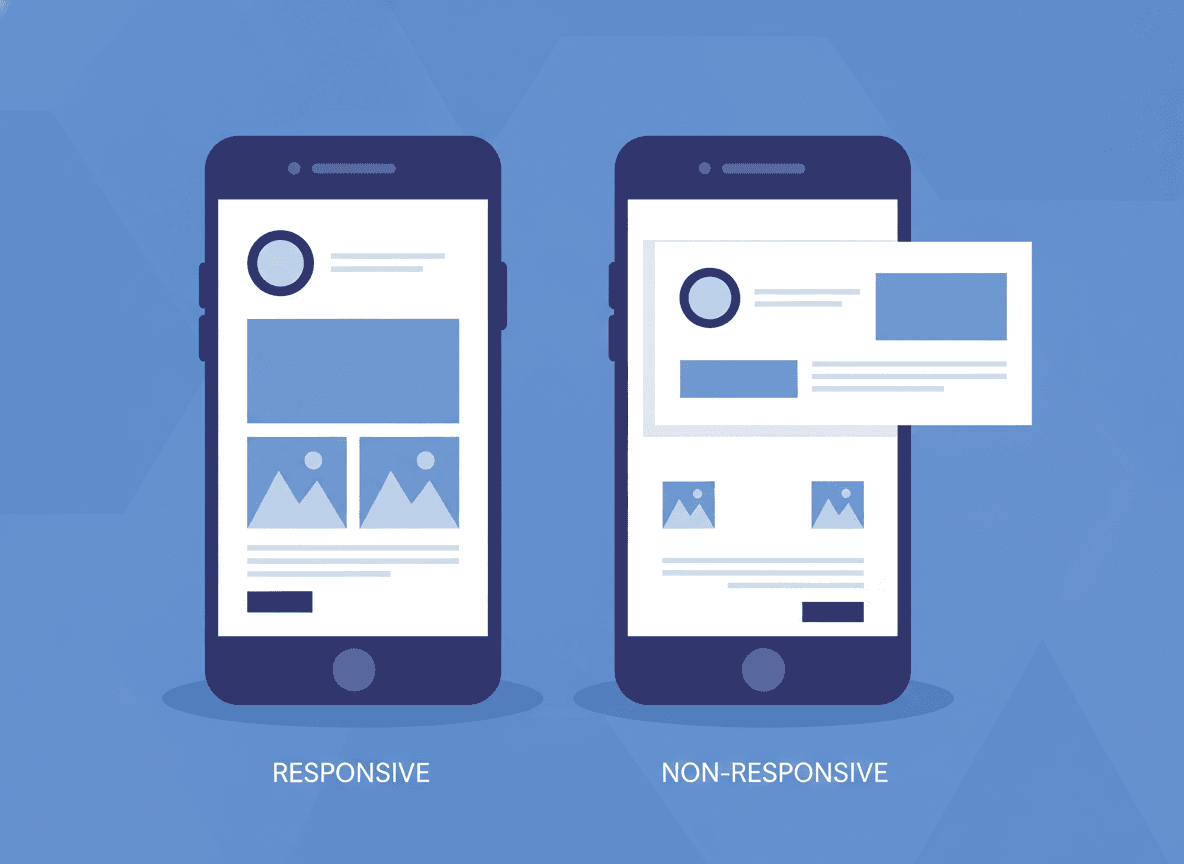
Use a single-column layout
Single-column layouts are the simplest and most reliable format for mobile email. Content stacks vertically and reads naturally from top to bottom regardless of screen size.
If you want visual variety, use full-width section dividers, background colors on sections, or image blocks that span the full column width. These create structure without requiring multi-column complexity.
Set minimum font size at 14px for body text
14px is the minimum readable body text size for mobile. 16px is better. Headings should be at least 20 to 22px to create visible hierarchy.
Check your template's font size settings before sending. Many default email templates use 12 to 13px body text, which is too small for comfortable mobile reading.
Make images responsive
Set images to 100% width within the container rather than a fixed pixel width. This lets them scale down proportionally on smaller screens without overflowing or distorting.
Also add descriptive alt text to every image. If an image fails to load (common on slow mobile connections), alt text tells the parent what they would have seen. "Students presenting their science fair projects" as alt text is more useful than a broken image icon.
Test on a real phone before you send
Most newsletter tools have a mobile preview mode. Use it. But also send a test email to yourself and open it on your actual phone. Preview modes are approximations. Your phone shows you the truth.
Check these things on your phone before sending:
- Does all the text fit without horizontal scrolling?
- Are headers visibly larger than body text?
- Do images load and display at a reasonable size?
- Can you tap links and buttons without zooming?
- Is the content readable without pinching or zooming?
Keep line length manageable
Long paragraphs that stretch the full width of a phone screen become exhausting to read. The eye has to travel far left to right, and it is easy to lose your place.
Keep body text at a comfortable line length. Most newsletter tools constrain the content width to 600px maximum, which gives you reasonable line length on desktop. On mobile, lines naturally become shorter due to the narrow screen, which actually improves readability.
Avoid PDF attachments
PDFs are terrible on mobile. They require a second tap to open, often open in a browser tab rather than inline, and are difficult to read or interact with on small screens. If the information belongs in your newsletter, put it in the newsletter. If it is supplementary, link to a web page rather than a PDF.
Daystage is built mobile-first by default
Daystage newsletters use a single-column, responsive layout that renders correctly across Gmail, Apple Mail, and Outlook on all device sizes. You do not need to configure this or test it manually every week. The newsletter you create in Daystage looks the same on a 375px iPhone screen as it does in a browser window on a 27-inch monitor.
Mobile-friendly should be the default, not the exception. For newsletters that are meant to inform every parent, it is not optional.
Get one newsletter idea every week.
Free. For teachers. No spam.
Frequently asked questions
When should teachers test their school newsletter on mobile?
Before every single send. Send a test email to yourself and open it on your actual phone before it goes to parents. Preview modes in newsletter tools are approximations. Your phone shows you what 60 to 70 percent of your parents will actually see.
What font size makes school newsletters readable on mobile devices?
14px is the minimum for body text on mobile. 16px is better. Headings should be at least 20 to 22px to create visible hierarchy. Many default email templates use 12 to 13px body text, which is readable on a desktop screen but requires zooming on a phone at arm's length.
How should teachers format images in school newsletters for mobile?
Set images to 100 percent width within the container rather than a fixed pixel width. A 600px-wide fixed image overflows on a 375px phone screen. Also add descriptive alt text so parents know what they would have seen if an image fails to load on a slow mobile connection.
What formatting mistakes most damage school newsletter mobile readability?
Multi-column layouts that break into unreadable stacks on phones, text under 14px, fixed-width images that overflow the screen and cause horizontal scrolling, and content copy-pasted from Word or Google Docs that brings invisible formatting. Any of these can make a newsletter that looks fine on a laptop nearly unreadable on a phone.
What tool creates mobile-friendly school newsletters without requiring teachers to know HTML or CSS?
Daystage builds newsletters in a single-column, mobile-first layout by default. Teachers write the content and the mobile rendering is handled automatically, so every newsletter looks clean on any screen size without extra work.

Adi Ackerman
Author
Adi Ackerman is a former classroom teacher and curriculum writer with 8 years in K-8 schools. She writes about school communication, parent engagement, and what actually works in real classrooms.
More for Parent Engagement
School Newsletter Communication for Military Families: Serving Families Who Move Often
Parent Engagement · 5 min read
Weekly, Monthly, or Quarterly: Which Newsletter Frequency Is Right for Your School?
Parent Engagement · 6 min read
How to Make School Newsletters Accessible to All Families Including Low-Income Households
Parent Engagement · 7 min read
Ready to send your first newsletter?
3 newsletters free. No credit card. First one ready in under 5 minutes.
Get started free