

School Newsletter Design Tips: How to Format Your Newsletter for Maximum Readability
Most school newsletters are designed accidentally. Teachers choose whatever their email client defaults to, paste in their updates, and hit send. The result is a newsletter that functions but does not invite reading.
Design is not about making things pretty. It is about making things readable. A well-formatted newsletter removes friction between the parent and your content. Here is how to get there without becoming a graphic designer.
Design for the phone first
The majority of parents read school emails on their phone. If your newsletter only looks good on a desktop, you are designing for the minority. Check every newsletter on mobile before sending.
On mobile, readability comes from:
- Single-column layout (not side-by-side columns)
- Text that does not require zooming
- Buttons and links large enough to tap easily
- Images that scale down without breaking the layout
Tools like Daystage are built mobile-first by default. Newsletters are rendered in a single-column layout that looks clean on any screen size without extra setup.
Use your school colors, but do not overdo it
A consistent color palette tied to your school brand builds recognition. Parents learn to associate your colors with your newsletter. Over time, they recognize your email before they even read the From name.
That said, color is a tool, not a decoration budget. One or two accent colors used consistently outperforms five colors used randomly. Use your primary school color for headers and section dividers. Keep body text black or very dark gray on a white or near-white background. High contrast is the foundation of readability.
Hierarchy: make the structure visible at a glance
Visual hierarchy tells the reader where to look first, second, and third. Without it, every element competes for attention and nothing wins.
A simple hierarchy that works for school newsletters:
- Large header: Your school name and newsletter title. Anchors the communication.
- Section headings (H2): Label each major topic. Make them bold and noticeably larger than body text.
- Body text: Standard size, readable line length. Aim for 60 to 75 characters per line.
- Calls to action: Buttons or bolded links that stand out from body text.
If everything looks the same weight, nothing gets read. Give parents visual cues about what matters most.
Choose readable fonts over expressive ones
Script fonts, decorative fonts, and ultra-light weights are hard to read on small screens. They also render inconsistently across email clients.
Stick to web-safe fonts or widely supported system fonts: Georgia, Arial, Helvetica, or system-ui. If you use a custom font, test it on Gmail, Apple Mail, and Outlook to confirm it renders correctly. A newsletter that falls back to Courier New in Outlook is a bad experience regardless of how good it looked in preview.
Body text should be at least 14px. Anything smaller strains the eyes on mobile.
Use white space generously
White space is not wasted space. It is visual breathing room that makes reading easier. Cramming content together to fit more in one newsletter creates a dense, overwhelming impression that drives parents to skim or stop.
Add padding above and below section headings. Leave space between paragraphs. Give images room on all sides. If your newsletter feels full, that is often a sign you need to remove content, not shrink the margins.
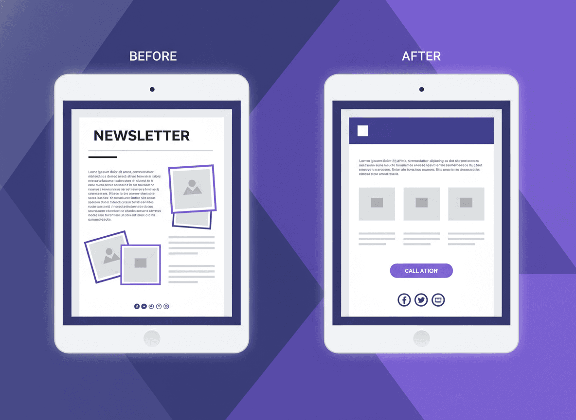
Images: yes, but strategically
A classroom photo adds warmth and gives parents a window into their child's day. But images also slow load times and can break layouts if not sized correctly.
One to three images per newsletter is plenty. Use photos from the classroom if you have them. Avoid clip art, stock photos of children you did not take, and decorative images that add noise without adding information. Every image should either show something real from your classroom or illustrate something specific in your content.
Compress images before uploading. A 3MB photo is the same visual quality as a 200KB compressed version, but loads 15 times faster.
Consistent format is a design advantage
The most underrated design tip for school newsletters is this: do not redesign every week. Pick a layout, stick to it. Parents learn your format quickly. Once they know where to find "upcoming dates" and where to look for "action items," they can navigate your newsletter in seconds.
Consistency also saves you time. If you build your newsletter in the same template every week, you spend your energy on content, not on reformatting the header.
Daystage saves your school branding, logo, and color settings once. Every newsletter you create inherits those settings automatically. The design is consistent by default, which means you never have to think about it again.
Get one newsletter idea every week.
Free. For teachers. No spam.
Frequently asked questions
When should teachers check how their school newsletter looks on mobile?
Before every send. Send a test email to yourself and open it on your actual phone. Preview modes in newsletter tools are approximations. Your phone shows you what most parents will see, since 60 to 70 percent of school emails are opened on mobile devices.
What font size should school newsletters use for body text?
14px is the minimum for mobile readability. 16px is better. Headings should be at least 20 to 22px to create visible hierarchy. Many default email templates use 12 to 13px body text, which requires zooming on a phone and drives readers away.
How should teachers structure the visual hierarchy of a school newsletter?
Use four visible levels: a large header with school name, section headings that are bold and noticeably larger than body text, standard body text, and calls to action that stand out as buttons or bolded links. If everything looks the same visual weight, nothing gets read.
What design choices most reduce school newsletter readability for parents?
Multi-column layouts that break on mobile, fonts under 14px, decorative or script fonts that render inconsistently across email clients, and fixed-width images that overflow on phone screens. Content built in a word processor and copy-pasted also brings invisible formatting that breaks rendering across devices.
What tool helps teachers design school newsletters that work well on all devices?
Daystage is built mobile-first by default. Newsletters render in a single-column layout that looks clean on any screen size without extra setup, which means teachers do not have to think about responsive design.

Adi Ackerman
Author
Adi Ackerman is a former classroom teacher and curriculum writer with 8 years in K-8 schools. She writes about school communication, parent engagement, and what actually works in real classrooms.
More for Parent Engagement
How to Write School Newsletters That Engage Grandparents and Extended Family
Parent Engagement · 5 min read
School Newsletter Communication for Military Families: Serving Families Who Move Often
Parent Engagement · 5 min read
Weekly, Monthly, or Quarterly: Which Newsletter Frequency Is Right for Your School?
Parent Engagement · 6 min read
Ready to send your first newsletter?
3 newsletters free. No credit card. First one ready in under 5 minutes.
Get started free