
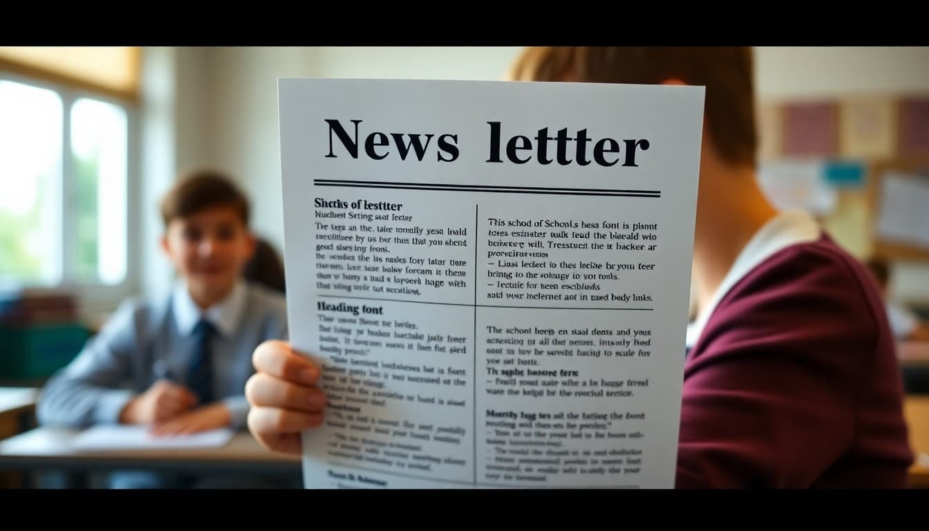
School Newsletter Font Guide: Readable and Beautiful Choices
Typography in email newsletters is more constrained than on the web, but that constraint makes the decisions simpler. A well-chosen font pair applied consistently will carry your newsletter through years of publication without needing to change. Here is how to choose fonts that are readable, appropriate, and actually display correctly in email.
Understand How Email Fonts Work
Email clients render fonts differently than web browsers. If you specify a custom font that is not installed on a reader's device, the email client substitutes a fallback font. This means a newsletter that looks carefully typeset in your editor might display in Times New Roman on someone's phone. The solution is to choose web-safe fonts or widely available Google Fonts that your newsletter platform supports. Fonts like Open Sans, Lato, Roboto, Georgia, and Arial display consistently across nearly every email client and device.
Choose One Heading Font and One Body Font
The most effective newsletter typography uses exactly two fonts. Pick a clear sans-serif for headings, something with distinct letterforms that reads well at 24 pixels. Pick a readable font for body text, which can be the same family in a lighter weight or a complementary option. Using the same font family in different weights is the simplest approach and produces the most coherent result. Open Sans Bold for headings and Open Sans Regular for body text is a classic combination that works in virtually any context.
Set a Type Hierarchy and Stick to It
A type hierarchy means that headings, subheadings, body text, and captions each have a defined size and weight that you apply consistently. A simple hierarchy might be: main headline at 26px bold, section heading at 20px bold, body text at 16px regular, caption at 13px italic. When every element has its defined place in the hierarchy, readers can navigate your newsletter by scanning rather than reading. That navigability is a direct result of typographic consistency.
Test Readability on a Phone First
Design your newsletter on a laptop and it will look fine. Send it to your phone and read it the way a parent reads it, while multitasking in a short window, and you will immediately know if the font is too small, too light, or too decorative to read quickly. Before finalizing any font choice, send a test email and read it on the smallest screen you have access to. Body text that requires effort to read at 16px on a phone will not be read at all by most parents.
Avoid Fonts That Make Your Newsletter Look Unprofessional
Certain fonts carry associations that work against school communication. Comic Sans signals informality in a way that is difficult to overcome. Very decorative script fonts suggest a party invitation rather than an educational institution. Fonts with very thin strokes look elegant on a high-resolution display but become invisible on older or lower-resolution screens. When in doubt, choose the more neutral option. Neutral fonts let your content do the communicating rather than the typography.
Line Length and Line Spacing Matter as Much as Font Choice
Even the best font is unreadable when lines are too long, too short, or too tightly spaced. For email newsletters, aim for 50 to 75 characters per line and 1.5 times the font size as line height. Those proportions, developed from decades of print and digital typography research, make text feel comfortable to read. A single-column newsletter with a maximum width of 600 pixels naturally produces good line lengths if your font size is in the 15 to 16 pixel range.
Document Your Font Choices and Apply Them System-Wide
Write down your chosen fonts, sizes, and weights for every text element in your newsletter. Share that document with anyone who contributes to or manages the newsletter. When Daystage stores your font settings at the account level, every newsletter created in that account uses the same typography automatically. That system-level consistency is more reliable than individual discipline and produces the typographic coherence that makes newsletters look professionally designed.
Get one newsletter idea every week.
Free. For teachers. No spam.
Frequently asked questions
What is the most readable font size for a school newsletter body text?
16 pixels is the recommended minimum for body text in email newsletters, especially for mobile reading. Some designers use 15 pixels for emails, but anything smaller starts creating eyestrain on phone screens. Headings should be at least 20 to 24 pixels to create clear visual hierarchy. When in doubt, go slightly larger rather than smaller.
Should I use the same font as my school website in my newsletter?
If the font is web-safe or available in your newsletter platform, yes. Visual consistency across channels builds recognition. However, email clients render fonts differently than web browsers, and some custom fonts will not display in email at all. Choose fonts that are available in both contexts, or choose separate but complementary fonts for each channel.
What fonts should I absolutely avoid in a school newsletter?
Avoid Comic Sans, Papyrus, and other novelty fonts that undermine credibility. Avoid script or handwritten fonts for anything other than decorative headers, as they are very difficult to read in body text. Avoid fonts with thin strokes, which become invisible at small sizes on mobile screens. When uncertain, choose the simpler, more neutral option.
Can I use more than two fonts in my newsletter?
You can, but you probably should not. Two fonts, one for headings and one for body text, is enough for a clean, professional newsletter. A third font can be used sparingly for captions or pull quotes. More than three fonts creates visual confusion and signals that no typographic system was applied. Constraint produces better results than variety.
Does Daystage support custom fonts in school newsletters?
Daystage provides a curated set of fonts optimized for email readability. You select your font choices in the newsletter settings and they apply consistently across every issue. That system-level consistency prevents the most common font drift problem, where different sections of a newsletter end up in different fonts because someone made ad hoc selections.

Adi Ackerman
Author
Adi Ackerman is a former classroom teacher and curriculum writer with 8 years in K-8 schools. She writes about school communication, parent engagement, and what actually works in real classrooms.
More for Guides
Ready to send your first newsletter?
3 newsletters free. No credit card. First one ready in under 5 minutes.
Get started free