
School Newsletter Color Scheme Guide: Brand Matching Made Simple

Color is one of the first things families notice about a school newsletter, and it is one of the easiest things to get consistently wrong. A color scheme that fights against readability, clashes with your school brand, or changes every few weeks signals that no one is in charge of the newsletter's visual identity. Here is how to make color work for you rather than against you.
Start With Your School's Brand Colors
Your school already has colors. They are on the logo, the website, the gym walls, and the spirit store merchandise. Those colors are your starting point. Using them in your newsletter creates visual continuity between your digital communication and everything else families associate with the school. If you do not know the official hex codes for your school colors, check with the district office or extract them from your website using a free color picker browser extension.
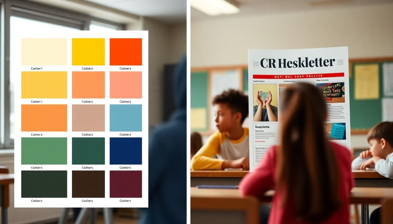
Build a Three-Color System
Most professional newsletters, school or otherwise, use three colors: a primary accent for headings and buttons, a background color (usually white or very light gray), and a text color for body copy (usually near-black, not pure black). Three colors consistently applied is cleaner and more readable than five or six colors used inconsistently. If your school has two main brand colors, use one as the primary accent and use white and dark gray as the remaining two. That combination works almost universally.
Test Your Color Contrast for Accessibility
A beautiful color scheme that is unreadable for families with low vision or color blindness is not a good color scheme. Before finalizing your palette, run your heading color on your background and your body text color on your background through a free contrast checking tool. WCAG AA compliance requires a ratio of 4.5:1 for body text. Most dark text on white backgrounds passes easily. Light text on medium backgrounds and colored text on colored backgrounds are where problems show up.
Use Accent Color Sparingly
Accent colors, your school blue or green or maroon, should appear in specific places: headings, horizontal dividers, button backgrounds, and perhaps the newsletter header banner. When accent colors appear everywhere, they stop signaling importance and start creating visual noise. The rule of thumb is to use your accent color for no more than 20 percent of the visible newsletter area. The rest should be neutral. That ratio keeps the accent feeling distinctive.
Keep the Same Colors Every Week
Visual consistency builds brand recognition. Families who see the same green header every Monday morning begin to associate that color with your newsletter before they even read the subject line. If your color scheme changes frequently, you lose that recognition effect and the newsletter feels like a different publication every time. Set your color system once, apply it consistently, and do not change it unless there is a specific reason to rebrand.
What to Do When Your School Colors Are Hard to Read
Some school color combinations, bright yellow, neon green, very light pastels, are difficult to use for text and headers without an accessibility problem. In those cases, use the brand color for decorative elements like the newsletter header, dividers, and button backgrounds, and use a dark neutral for all text. Your newsletter will still feel brand-aligned without creating a readability problem. Daystage applies your school colors to the right elements by default, which avoids the most common color placement mistakes.
Document Your Color Choices
Write down the specific hex codes for every color in your newsletter scheme and save them somewhere accessible. When you onboard a new teacher to the newsletter system, or when you return to the newsletter after a break, having those codes documented prevents color drift. A simple document with three hex codes and where each one is used is all the documentation you need. That five-minute investment keeps your newsletter visually consistent across years of publication.
Get one newsletter idea every week.
Free. For teachers. No spam.
Frequently asked questions
Should my school newsletter colors match the school website exactly?
As closely as practical. Visual consistency across all school communications builds brand recognition and signals that the school takes its public-facing materials seriously. If your school has official brand colors defined in a style guide, use them. If not, extract the dominant colors from your school logo as a starting point.
How do I find the exact color codes my school uses?
Check with your district communications office, which may have a brand guide. If none exists, use a color picker tool or browser extension to sample colors from your school website or logo. The hex code for that color, something like #1A3A6B, gives you the exact value to use consistently in your newsletter platform.
What colors should I avoid in a school newsletter?
Avoid very light text on white backgrounds, which creates contrast problems for readers with visual impairments. Avoid more than three main colors in a single issue, which creates visual noise. Avoid using the same bright color for both headings and body text, which removes the hierarchy that helps readers navigate quickly.
How do I know if my color scheme is readable for everyone?
Test your heading and body text colors against your background using a free online contrast checker. WCAG AA accessibility guidelines require a contrast ratio of at least 4.5:1 for body text. If your school colors do not meet that threshold for body text, use them for headings and buttons and use a high-contrast dark color for body text instead.
How does Daystage help with newsletter color consistency?
Daystage lets you set your school brand colors once and applies them consistently across every newsletter you create. You do not need to re-enter hex codes or re-select colors each time. That built-in consistency is exactly the kind of visual professionalism that families notice over time.

Adi Ackerman
Author
Adi Ackerman is a former classroom teacher and curriculum writer with 8 years in K-8 schools. She writes about school communication, parent engagement, and what actually works in real classrooms.
More for Guides
Ready to send your first newsletter?
3 newsletters free. No credit card. First one ready in under 5 minutes.
Get started free