

School Newsletter Branding Guide: Consistency Across Schools
A district with 12 schools can easily end up with 12 completely different-looking newsletters. Some are gorgeous. Some look like they were made in 2003. When a parent has kids at two schools, the inconsistency is jarring. A newsletter branding guide fixes this problem once and reduces everyone's design decision fatigue going forward.
Start with a Brand Audit
Before writing any standards, collect the last three newsletters from every school in the district. Print or display them side by side. Note the colors, fonts, logo placement, and general quality range. This audit tells you what you are working with. Usually there are two or three schools doing excellent work. Those become the reference point for the standards, not an imaginary ideal. Staff are more receptive to standards based on "here is what Lincoln Elementary is doing well" than "here is what corporate says newsletters should look like."
Define the Non-Negotiable Brand Elements
Pick three to five elements that every newsletter must use regardless of school. These typically are: the district logo in the header, the primary district color (at least in the header bar), the official district font for headlines, a footer with the district address and unsubscribe option, and the district tagline or mission statement. Everything else can flex. Non-negotiables need to be enforceable without constant oversight. If every newsletter platform in the district uses the same template, enforcement is automatic.
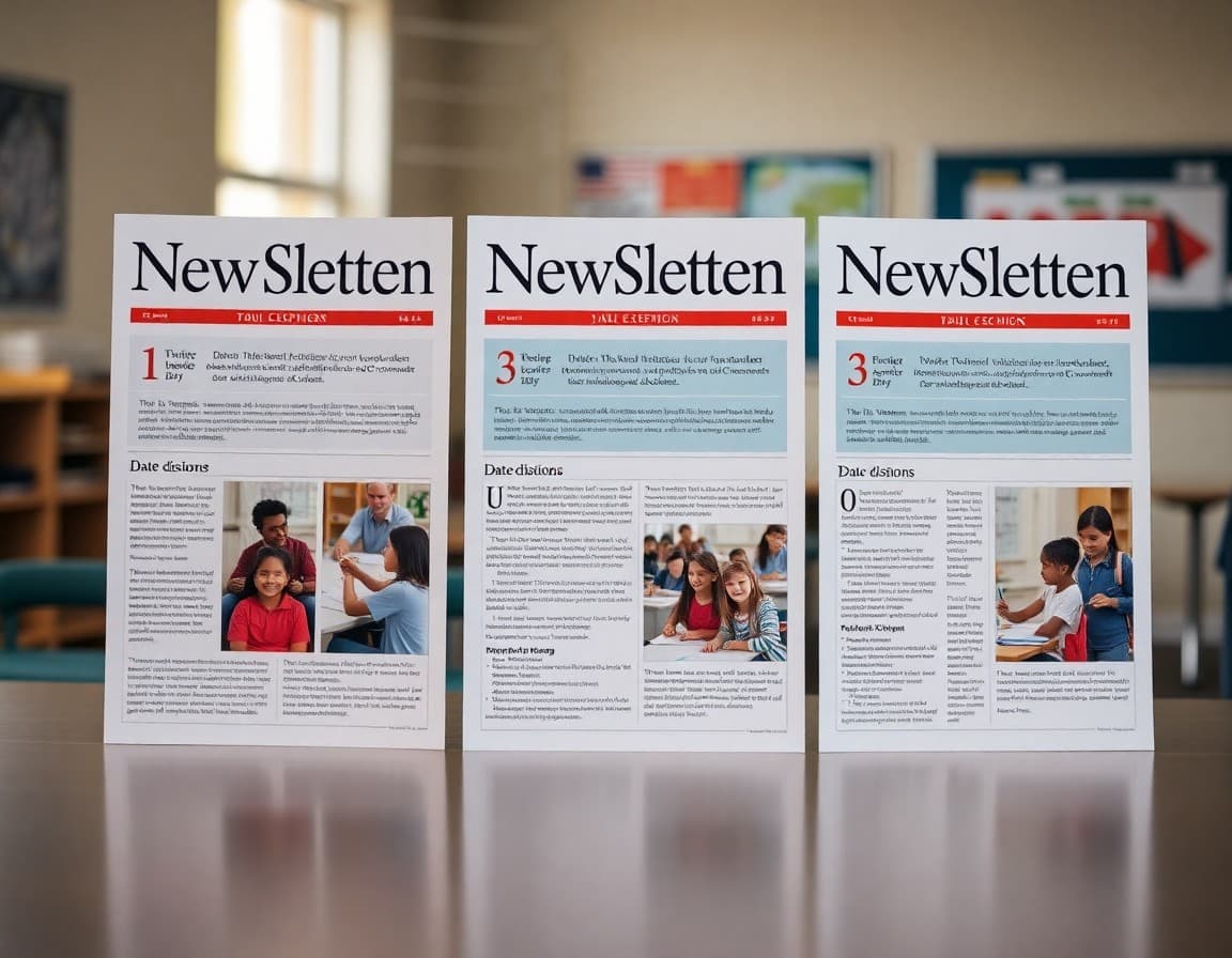
Build a Two-Tier Template System
Create a master district template with the locked header and footer. Inside the content area, give schools a set of approved section styles: a headline block, a body text block, a photo block, an event block, and a call-to-action block. Schools choose from these blocks to build their issues. This is exactly how major media companies manage regional editions of a national brand. Consistent structure does not mean identical content. Every school's news is different; the container is the same.
Color Palette and Font Rules
Specify exact hex codes for approved colors, not just "blue" or "school colors." If the district primary color is #003087 (navy blue), write that in the guide. Provide the secondary accent color and the approved text colors. For fonts, pick one headline font and one body font. Both should be available as web fonts so newsletters render correctly in email clients. Sans-serif fonts like Open Sans, Lato, or Nunito are safe choices because they render clearly at all sizes on screens and in print.
Logo Placement and Clear Space Rules
The district logo should appear at the top left or top center of every newsletter header. Specify the minimum size in pixels (at least 100px tall for email) and the required clear space around it (no other design element within 20px of the logo edge). Provide an approved set of logo files in PNG and SVG format so schools are not resizing and distorting a low-resolution JPEG they found on the old website. A logo library in a shared Google Drive folder, updated by communications staff, solves this permanently.
Writing the Voice and Tone Section
Brand consistency is not just visual. Districts that let every school write in a completely different voice confuse parents who interact with multiple schools. Define three adjectives that describe the district's communication voice: for example, "clear, warm, and reliable." Then provide a before-and-after example showing bureaucratic language transformed into the district voice. "Students will be expected to adhere to revised arrival procedures effective Monday" becomes "Starting Monday, doors open at 8:00 AM instead of 7:45. Please plan accordingly."
Training School Staff on the Standards
A branding guide no one reads is decorative. Schedule a 30-minute training in early August for every staff member who sends school newsletters. Walk through the template, show the logo file location, and demonstrate the approved color palette. Record the session for staff who miss it. Follow up in October with a brief check-in newsletter from the district communications office. Schools that participate in hands-on training show significantly higher compliance than those that just receive a PDF guide.
Reviewing and Updating the Guide Annually
Review the branding guide each August before the school year starts. Update the logo files if the district rebranded. Add new approved section types if the newsletter platform introduced new features. Remove rules that no one is following because they are impractical. A guide that evolves with real usage stays relevant. One that was last updated in 2019 gets ignored. Treat the guide as a living document with a version number and a last-updated date at the top.
Get one newsletter idea every week.
Free. For teachers. No spam.
Frequently asked questions
Why does consistent branding matter for school newsletters?
Parents who move between schools in the same district, or who have children at multiple schools, notice quickly when newsletters look and feel completely different. Consistent branding signals organizational competence. It also reduces the cognitive load on parents; they know where to find dates, where to find the principal message, and what the color-coded urgency signals mean. Districts with newsletter standards report fewer complaints about communication quality.
What elements should a district newsletter branding guide cover?
At minimum, cover: the primary and secondary color palette, approved fonts (two at most), logo placement rules, required sections in each issue, header and footer templates, the tone and voice guidelines, and any legal or compliance language that must appear in every issue. Ideally, also include a prohibited elements list. Telling staff they cannot use clip art, red ALL CAPS text, or third-party fonts prevents the most common inconsistencies without requiring ongoing policing.
How do you balance district branding with individual school identity?
A two-tier system works well. The top section of every newsletter uses district-approved colors, the district logo, and standardized fonts. The school-specific content below that header uses the school's own logo, mascot, and color accent within approved limits. Think of it like a franchise model: McDonald's controls the golden arches but each location has some local menu flexibility. Districts that enforce the header and footer but allow school-specific body content get compliance without resentment.
What happens when individual teachers send un-branded class newsletters?
Teacher-level newsletters are usually outside district branding control, and that is fine. The district should focus branding standards on official school and district newsletters, not individual classroom communications. The risk is when a teacher's un-branded newsletter is mistaken for an official school communication. Solve this by making the official newsletter so recognizable that parents immediately distinguish it from informal classroom notes.
Does Daystage support district-level branding applied across multiple schools?
Yes. Daystage has a district tier that lets district administrators set the logo, primary color, and approved template for all schools in the district. Individual school staff can customize their content within those parameters but cannot override the core branding elements. This means every school in the district sends newsletters that look like they come from the same organization, with no manual template management required from each principal.

Adi Ackerman
Author
Adi Ackerman is a former classroom teacher and curriculum writer with 8 years in K-8 schools. She writes about school communication, parent engagement, and what actually works in real classrooms.
More for Guides
Ready to send your first newsletter?
3 newsletters free. No credit card. First one ready in under 5 minutes.
Get started free