

Preschool Newsletter: What to Include (And What to Leave Out)
Most preschool newsletters fail for one of two reasons. They are either so sparse that parents cannot picture what their child's day looks like, or they are so packed that parents skim the subject line and move on. Neither version builds the trust and connection that makes early childhood parent communication worth doing.
This guide covers the sections that belong in a preschool newsletter, the things that should be cut, and the practical decisions around length, photos, and timing that determine whether families actually read what you send.
The Three Sections That Always Belong
Every preschool newsletter needs three things, regardless of what else you add or cut:
- What we did this week. A short description of the main activity, theme, or project. Two to four sentences. Specific enough that a parent can reference it when talking to their child.
- What is coming up. Upcoming dates, events, or changes to routine. This is especially important in early childhood, where predictability is a real comfort for children and their families.
- One conversation starter. A specific question or observation parents can use at home. "Ask your child what color they mixed to make orange" works better than "Talk to your child about what they learned."
These three sections serve the full purpose of a preschool newsletter: give parents a window into the classroom, handle the logistics they need to know, and give them a way to connect with their child about school. Everything else is optional.
What to Add If You Have Room
Beyond the core three, some sections add real value when they are relevant. A brief note on what skill or concept the class is working on (without jargon), a recognition of something the class did well together, a specific request for materials or help with an upcoming project, or a note about the current developmental theme (separation, sharing, making friends) can all strengthen the newsletter when used selectively.
The key word is selectively. Not every newsletter needs all of these. Adding sections because you feel like you should fill space is how newsletters become walls of text that parents stop reading.
What to Cut
Several things consistently clutter preschool newsletters without adding value for families.
Long curriculum overviews. A three-paragraph explanation of the phonological awareness unit is not useful to the parent of a three-year-old. One sentence about what the children are exploring and why it matters is enough.
Reminders that already went home in a separate note. If you sent a permission slip last week, you can note the deadline in one line. You do not need to re-explain the whole field trip.
Generic positive affirmations. "Your child is amazing!" and "We are so grateful for this community!" take up space without saying anything. Cut them.
Anything that belongs in a private message. Individual child updates, concerns about a specific family's situation, or anything that could be read as referring to one child even if written generally: all of this belongs in a direct conversation, not a group newsletter.
Photo Guidelines
Photos are one of the most powerful parts of a preschool newsletter. A parent who sees their child in the middle of an activity gets an immediate, emotional connection to what the newsletter is describing. But photos also carry real responsibilities.
Check your school or program's photo policy before including any photos of children. Most programs require parent consent to photograph children and additional consent to share those photos in communications. Keep a record of which families have consented and which have opted out, and never include a photo of a child whose family has not given permission.
When you do include photos, one or two per newsletter is the right range. More than that slows down the email, pushes text down below where many parents stop reading, and can make the newsletter feel more like a photo dump than a communication. Choose photos that show children engaged in an activity, not posed and smiling at the camera. Candid photos from actual work time are more interesting and more authentic.
Length: Less Than You Think
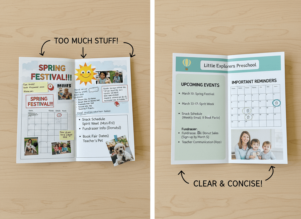
The right length for a preschool newsletter is shorter than most teachers write. Aim for something a parent can read completely in three minutes. That is roughly 300 to 450 words of text, not counting photos or headers.
The instinct to write more comes from a desire to be thorough, which is understandable. But in practice, a longer newsletter does not mean parents are more informed. It means they are more likely to skim, and skimming means they miss the important parts. A short newsletter that gets read cover to cover every week does more for your family communication than a comprehensive newsletter that most families scan and close.
Timing and Consistency
Send on the same day and at the same time every week. Families in early childhood settings are often managing complicated drop-off and pickup logistics. When they know the newsletter arrives Sunday evening, it becomes part of their routine. They look for it. They read it before the week starts. That reading habit is built by consistency, and it falls apart quickly when the schedule is unpredictable.
Sunday evening or Monday morning are the two times that work best for most preschool families. The newsletter is relevant to the week ahead, families are thinking about the school week, and it is early enough that parents have time to act on anything that requires a response before the week is underway.
Format: Email, Not a Link
Send the newsletter as an email, not as a link to a PDF or a separate website. Every extra click between a parent and the content is a chance for them to get distracted and not finish reading. A newsletter that opens directly in the inbox, with photos embedded and text readable without any extra steps, gets significantly more engagement than one that requires a click to view.
Tools like Daystage are built specifically for this: you create the newsletter in a block-based editor, add photos, and send directly to your classroom mailing list as a proper email. No PDF attachments, no links to open, no app for parents to download. Just a newsletter in their inbox that they can read right now.
Get one newsletter idea every week.
Free. For teachers. No spam.
Frequently asked questions
When should preschool teachers send newsletters to parents?
Monthly is the frequency that gets reliably read and stays sustainable through the full school year. Weekly newsletters are appealing in September and abandoned by November. A monthly newsletter families expect and open consistently does more for parent trust than a weekly newsletter that tapers into silence.
What should a preschool newsletter include?
Include what the class explored this month, one upcoming date that requires something from families, a take-home activity tied to the classroom theme, and a brief personal note from the teacher. That core structure is worth reading. Add a photo if consent allows and a supply reminder if needed.
How should preschool teachers decide what to leave out of a newsletter?
Leave out anything that belongs in a different channel. Logistics requiring immediate action belong in a same-day message, not the newsletter. Individual updates about a specific child belong in a private conversation. Generic policy reminders that appear unchanged month after month belong nowhere, because families have already read them and will skip them.
What are common mistakes in preschool newsletter content?
Packing too much into one newsletter is as damaging as sending too little. When families have to read three pages to find the one date that matters to them, they stop reading the next one. A newsletter that is too sparse, with just a date and a reminder, tells families nothing about what their child is actually doing and fails at its core purpose.
Is there a tool that helps preschool teachers decide what to include in a newsletter?
Daystage is built for early childhood teachers and provides a structured newsletter format that covers what matters without requiring you to edit down an overstuffed draft every month.

Adi Ackerman
Author
Adi Ackerman is a former classroom teacher and curriculum writer with 8 years in K-8 schools. She writes about school communication, parent engagement, and what actually works in real classrooms.
More for Pre-K
Ready to send your first newsletter?
3 newsletters free. No credit card. First one ready in under 5 minutes.
Get started free