
Mobile-Optimized School Newsletters: How to Design for Phones First
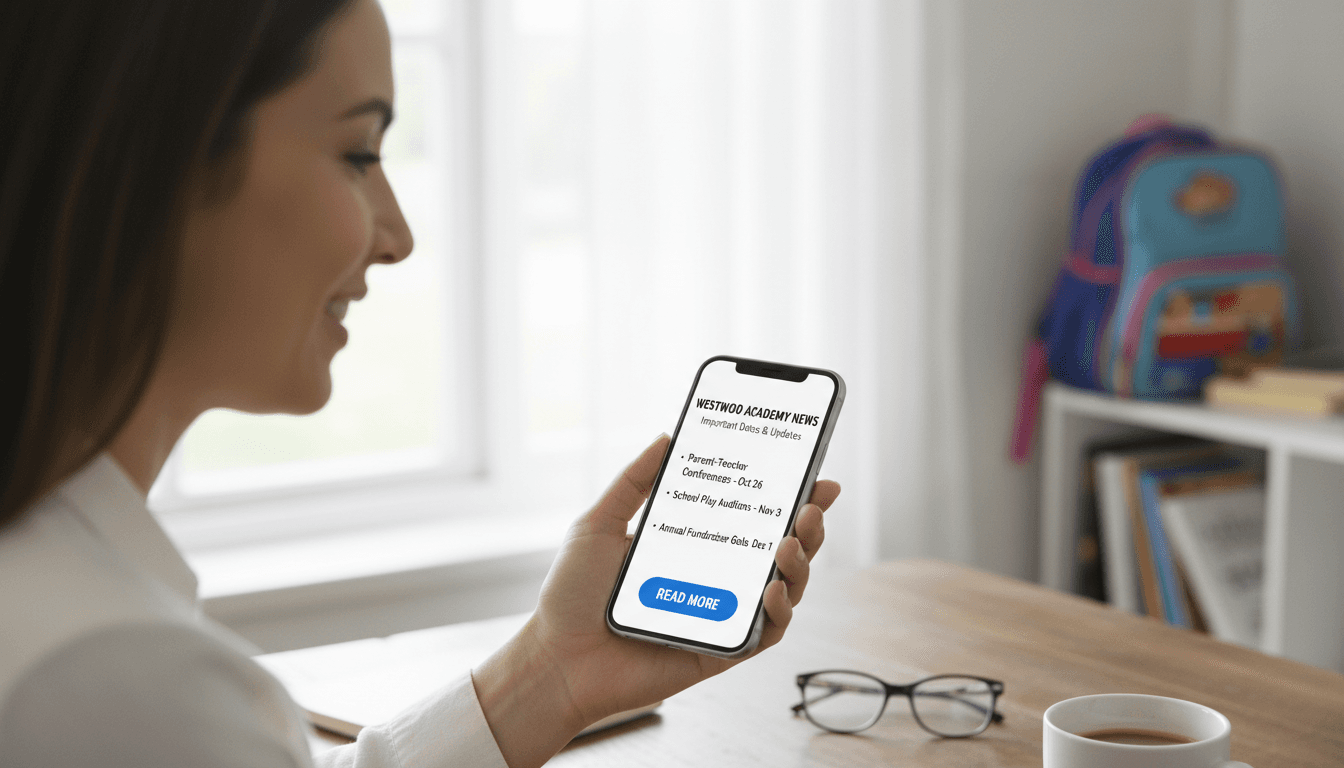
More than 65% of school emails are opened on smartphones. That number is higher for younger-grade parents and lower for older-grade parents, but across K-12, phones are the primary device for reading school email. Designing a newsletter that looks good on a desktop and breaks on a phone is designing a newsletter that most parents read in a broken state.
Mobile-first design is not a technical concept. It is a decision to build the newsletter for the conditions under which it will actually be read.
What breaks on mobile
Several newsletter design patterns that look fine on a laptop create serious problems on a 375px phone screen.
Wide images. An image sized at 800px wide will overflow the phone's screen. The parent has to scroll horizontally to see the full image, and most will not bother. They see the cropped version or skip the image entirely.
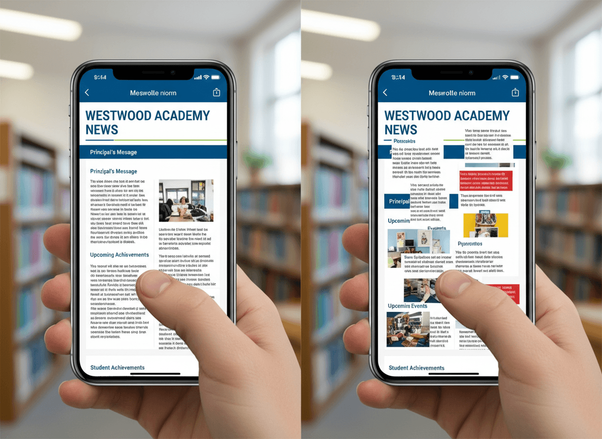
Multi-column layouts. A newsletter with two or three side-by-side columns looks clean on a 1200px desktop. On a 375px phone, those columns either overlap, force horizontal scrolling, or collapse in unpredictable ways depending on the email client. Parents see a scrambled layout.
Small fonts. Desktop newsletters often use 13-14px body text. On mobile, this requires the parent to pinch-zoom, and many email clients on mobile do not support pinch-zoom correctly. Text that requires effort to read gets skipped.
Small tap targets. Links and buttons that are easy to click with a mouse become difficult to tap with a finger. A link text that is 14px in a sentence requires precision tapping. A missed tap is a missed action.
Preview text ignored. Most email clients show a preview snippet below the subject line. This is prime real estate on mobile, where the subject line and preview text are often all a parent sees before deciding to open. Many newsletters leave this blank or have it auto-populated with boilerplate ("View this email in your browser...").
Rule 1: Single-column layout
The most important mobile design decision is to use a single-column layout. One column, full width, stacking vertically. No sidebars. No two-column event grids. No floating teacher photo beside a text block.
Single-column newsletters render correctly on every screen size without media queries or responsive CSS tricks. A 600px wide single column scales down cleanly to a 375px phone. A two-column layout requires correct CSS media query implementation to collapse properly, and many email clients ignore media queries entirely.
If you need to show two pieces of content side by side (before and after photos, two event dates), stack them vertically on mobile. This is not a design limitation. It is what actually works for the majority of your audience.
Rule 2: Minimum 16px text with sufficient contrast
16px is the minimum comfortable reading size on a mobile screen without zooming. Many email tools default to 14px body text. Change it to 16px.
Headers and subheadings should be at least 20px. This creates a clear visual hierarchy when parents scan the newsletter quickly, which is how most school newsletters are read on phones.
Line height should be 1.5x the font size (24px line height for 16px text). Tight line spacing is harder to read on high-resolution phone screens than on paper.
Color contrast matters more on mobile because phones are often viewed in bright outdoor conditions (pickup line, parking lot) where screen visibility is reduced. Dark text on light background, not light gray on white.
Rule 3: Touch-friendly buttons and links
Any interactive element in your newsletter should be at least 44x44px in tap target size. This is Apple's Human Interface Guidelines recommendation and matches what Google recommends for Android.
For action items in school newsletters (permission slip downloads, event registration links, school calendar links), use a button block rather than inline text links. A button with visible padding is easy to tap. A single underlined word in a sentence is not.
Space buttons at least 8px apart vertically so a missed tap does not accidentally trigger the wrong action.
Preview text: the second subject line
Preview text (also called preheader text) is the 50-100 character snippet that appears below the subject line in most email clients. On mobile, where the subject line is often truncated, preview text is the second most important factor in whether a parent opens the newsletter.
Always write custom preview text for every newsletter. It should not repeat the subject line. It should add a second specific detail that gives the parent another reason to open.
Subject line: "Ms. Kim's Class: Nov 4-8 Weekly Update" Preview text: "Field trip form due Thursday, plus our new science unit starts."
If your newsletter tool does not support explicit preview text, the first sentence of your newsletter body will display instead. Make the first sentence count.
Testing on actual devices
The only way to know if a newsletter looks right on mobile is to test it on an actual phone before sending to your full list. Send yourself a test email and open it on your phone. Then open it in Gmail on the phone. If you can, test on an iPhone and an Android device, since rendering differs between iOS Mail and Gmail's app.
What to check on the device:
- Does any content require horizontal scrolling?
- Can you read the body text without zooming?
- Do images load and fit the screen width?
- Can you tap buttons and links without hitting the wrong target?
- Does the layout look intentional, or does anything appear stacked or overlapping incorrectly?
Daystage uses MJML to generate newsletter email code. MJML's output uses table-based email layout (the most compatible method for email clients) combined with a single-column default that renders correctly on every major email client and phone screen without manual testing of edge cases. Teachers write the content, and the technical rendering is handled automatically.
The pickup line test
A useful mental model for school newsletter mobile design: would a parent waiting in the school pickup line, holding their phone in one hand, be able to read this newsletter and find the field trip date in under 30 seconds?
If the answer is no, something about the layout, font size, or information hierarchy is wrong. That is the condition under which many school newsletters are actually read. Design for it.
Get one newsletter idea every week.
Free. For teachers. No spam.
Frequently asked questions
When does mobile optimization become critical for school newsletters?
Mobile optimization matters from the first newsletter you send. More than 70 percent of school newsletter opens happen on mobile devices, predominantly iOS and Android. A newsletter that looks correct on desktop but breaks on mobile is effectively broken for the majority of your audience.
What should teachers prioritize when formatting a school newsletter for mobile?
Use a single-column layout, minimum 16px body text, touch-friendly buttons that are at least 44 pixels tall, and a font that renders cleanly at small sizes. The most important optimization is single-column layout, because multi-column layouts collapse differently on mobile depending on the email client and often produce unreadable text.
How do teachers test school newsletters for mobile before sending?
Send a test to yourself and open it on your phone using your primary email app. Check whether text is readable without zooming, whether buttons are easy to tap, whether images scale correctly, and whether the preview text shows what you intended. This takes 2 minutes and catches the most common mobile problems before parents see them.
What are common mobile layout mistakes in school newsletters?
Multi-column layouts that break into stacked single columns and leave images out of context are the most common mobile failure. Using 12px or 13px text, which is too small to read comfortably on a phone without zooming, is another frequent problem. Both are prevented by building in single-column format with a 16px minimum font size from the start.
What is the best tool for teachers who want school newsletters that look correct on mobile by default?
Daystage generates emails using MJML, a framework designed to produce responsive email layouts that render correctly across email clients and device sizes. Teachers do not need to manage mobile breakpoints or test across email clients. The responsive behavior is built into the output rather than being something the teacher configures.

Adi Ackerman
Author
Adi Ackerman is a former classroom teacher and curriculum writer with 8 years in K-8 schools. She writes about school communication, parent engagement, and what actually works in real classrooms.
More for Guides
Ready to send your first newsletter?
3 newsletters free. No credit card. First one ready in under 5 minutes.
Get started free