

How to Create an Infographic-Style School Newsletter
Most school newsletters arrive as walls of text. Parents open them, scan for their child's name or a familiar date, and close them. An infographic-style newsletter solves this by leading with visuals: icons, small charts, color blocks, and timelines that communicate at a glance. This guide walks through exactly how to build one, what to include, and what to skip.
Why Visual Layouts Outperform Text-Heavy Newsletters
Research on reading behavior consistently shows that people scan before they read. In a typical text newsletter, parents catch the first sentence and the last sentence of each paragraph. An infographic layout works with that habit instead of against it. When attendance data appears as a simple bar chart, a parent absorbs it in three seconds. When it sits in the third sentence of the second paragraph, most parents miss it entirely. Schools that switch to visual formats report higher click-through rates on event links and better parent recall of key dates.
Decide What Data Deserves Visual Treatment
Not everything needs a chart. The sections worth turning into visuals are the ones where comparison, progress, or sequence matter. Attendance rates, fundraising totals toward a goal, reading benchmark progress, and upcoming event timelines all translate well into infographic elements. Announcements about individual students, sensitive policy changes, or nuanced explanations of new programs read better as plain text. The rule: if you would naturally say the information as a number or a list of steps, it probably works as a visual.
Choose the Right Layout Structure
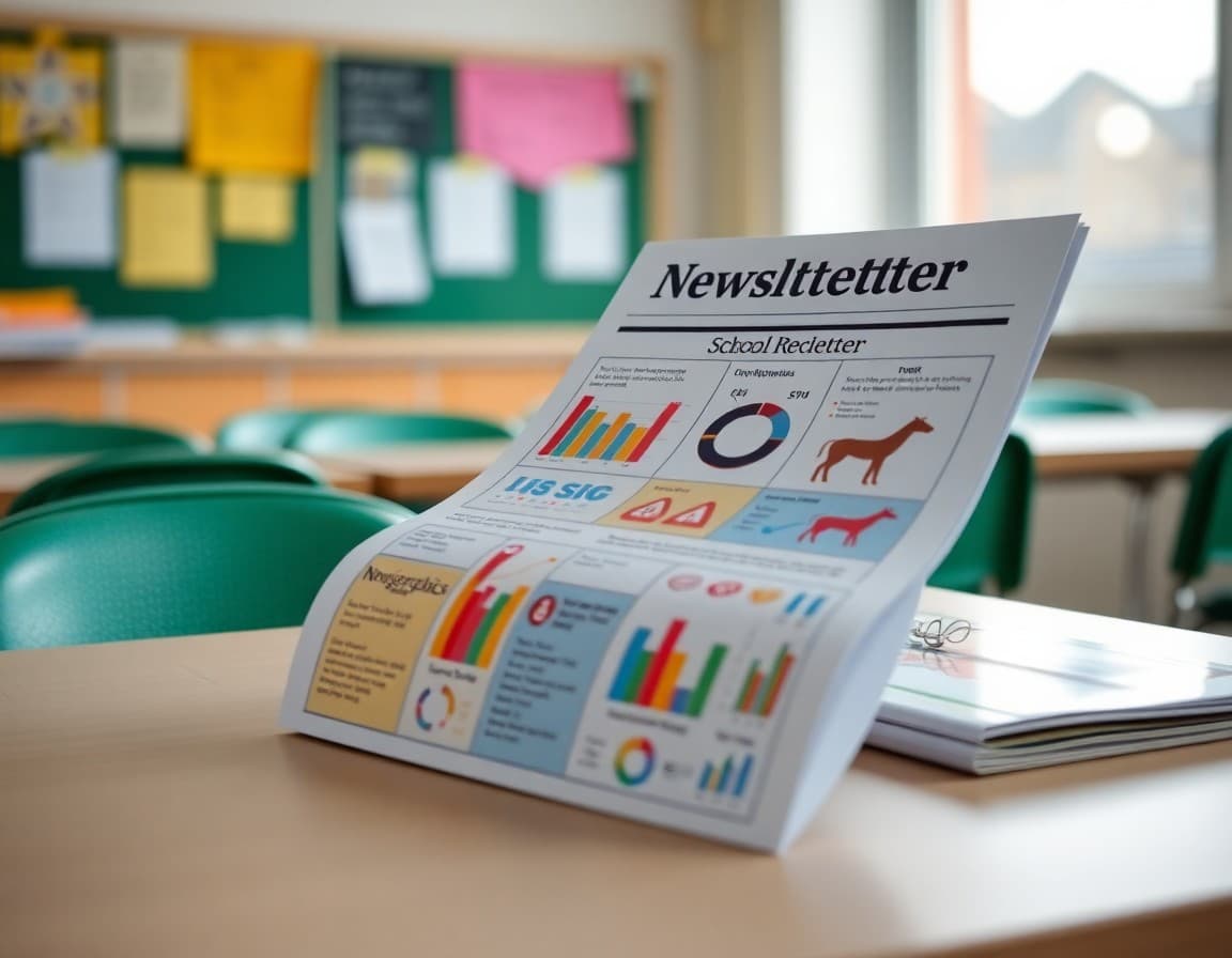
An infographic newsletter is not a single giant image. It is a structured document with visual sections interspersed with short text blocks. A practical structure for most schools looks like this: a bold header block with the school name and month, a three-column "quick stats" row showing attendance, this month's events, and a volunteer hours total, then alternating text-and-visual sections for each major topic. End with a simple timeline for the next four upcoming dates. This structure keeps the newsletter scannable on both desktop and mobile without requiring advanced design work.
Template Excerpt: Quick Stats Row
Here is an example of how to frame the top visual block in plain content before it becomes a designed element:
This Month at Lincoln Elementary
Attendance Rate: 94% (Goal: 96%)
Volunteer Hours Logged: 42
Library Books Checked Out: 318
Next Event: Spring Book Fair, April 14
When you drop this into a three-column grid with a small icon above each number, it becomes a genuine infographic row. Parents see the school's pulse at a glance before reading anything else.
Tools That Work Without a Designer
Canva's education templates include infographic layouts designed specifically for newsletters and reports. Google Slides works if your school already lives in Google Workspace and you export to PDF for printing. For digital-first delivery, block-based email builders let you drop in image sections alongside live text, which is important for accessibility and email deliverability. Avoid building the entire newsletter as one flat image file because screen readers cannot parse it and many email clients block images by default.
Color and Icon Discipline
Stick to two or three colors maximum: your school's primary color, a neutral background, and one accent for highlights or alerts. Icons should come from a consistent set, not a mix of clip art from different sources. One flat icon per section header keeps the layout clean. Adding too many decorative elements is a common mistake that makes the newsletter look cluttered rather than visual. Whitespace is doing real work here; do not fill every corner.
Making It Accessible for All Families
Infographic elements must include text alternatives for families using screen readers or those who receive images as blocked content in email. Add alt text to every chart and icon image. Include a brief text summary below each visual element for parents who cannot see the image. For printed versions sent home, test the printout in grayscale to confirm that color is not the only way information is conveyed. These steps take five extra minutes and ensure every family gets the same content.
Measuring Whether It Is Working
Track two metrics: open rate and link click rate. If your text newsletter had a 35% open rate and you switch to a visual format, look for improvement over three to four issues as parents recognize the new style. Also ask two or three parents informally what they remembered from the last newsletter. If they can name a specific number from your quick stats row, the visual format is working. If they draw a blank, revisit which data points you featured and whether the layout is too complex.
Get one newsletter idea every week.
Free. For teachers. No spam.
Frequently asked questions
What makes an infographic-style newsletter different from a regular one?
An infographic-style newsletter prioritizes visual elements like icons, charts, timelines, and color-coded sections over dense paragraphs. Parents can scan it in under two minutes and still absorb the key information. Regular text newsletters require sustained reading, which many busy families skip entirely.
Do I need design skills to create an infographic newsletter?
No. Most infographic newsletters for schools are built using drag-and-drop tools with pre-made templates. You replace placeholder text and swap in your school colors. If you can put together a PowerPoint slide, you can build an infographic newsletter. The key is choosing a tool designed for visual layouts rather than word processing.
How many data points should I include in one infographic section?
Limit each visual section to three to five data points. For example, if you are showing attendance stats, display this month, last month, and the school goal. More than five numbers in one chart overwhelms readers and defeats the purpose of visual communication. When in doubt, cut the least important number.
Can infographic newsletters work for emergency or safety communications?
Yes, but with care. A visual format works well for explaining a new safety protocol step-by-step. Avoid using a purely graphic format for genuinely urgent or sensitive communications where parents need to read every word. A brief text summary at the top followed by an infographic breakdown works well for those situations.
What tool makes it easiest to publish infographic-style newsletters to parents?
Daystage lets you build block-based newsletters with image sections, visual layouts, and formatted content without any design software. You can upload your infographic sections as images inside a structured newsletter, then send directly to parent emails. It keeps the visual appeal while ensuring reliable delivery.

Adi Ackerman
Author
Adi Ackerman is a former classroom teacher and curriculum writer with 8 years in K-8 schools. She writes about school communication, parent engagement, and what actually works in real classrooms.
More for Guides
Ready to send your first newsletter?
3 newsletters free. No credit card. First one ready in under 5 minutes.
Get started free