

School Newsletters in Dark Mode: How to Make Sure Your Design Still Looks Right
Dark mode is now the default setting for a significant portion of smartphone users. Apple Mail, Gmail on Android, and Outlook on both platforms all have dark mode implementations. When a parent opens your school newsletter in dark mode, the colors in your design may look completely different from what you intended, and in some cases, parts of the newsletter may become unreadable.
Understanding why this happens and what you can do about it is increasingly important for anyone sending school newsletters.
How dark mode changes email colors
Dark mode in email works by inverting or adjusting the colors in the email code. The specific behavior depends on the email client. Three things can happen when a parent opens your newsletter in dark mode:
- Full color inversion. The email client inverts all colors. White backgrounds become black. Black text becomes white. This is the most aggressive dark mode implementation and is used by Outlook on Windows.
- Partial override. The email client darkens backgrounds but leaves explicitly specified text colors alone. This can create situations where dark text is specified on an element, the background turns dark, and the text becomes nearly invisible. Gmail's dark mode behavior on Android falls into this category.
- No change. Apple Mail honors the explicit color values in the email's HTML and does not invert them if specific colors are declared. This is more predictable but means Apple Mail users in dark mode see a light email against a dark system interface.
The inconsistency across email clients is the core problem. There is no single approach that produces a perfect result in every dark mode implementation.
The most common dark mode failures in school newsletters
White text disappearing on white backgrounds. If your newsletter has a white background and white text is hidden inside an element (a common template pattern for hiding preheader text), dark mode inversion can turn the background black while leaving the white text, making it visible when it was meant to be hidden. The result is a mess of unwanted text at the top of the newsletter.
Logo backgrounds turning black. A school logo saved as a PNG with a transparent background will display against a dark background when dark mode inverts the email. If the logo has light or white elements, they become invisible. This is especially common with school logos exported from white-background documents.
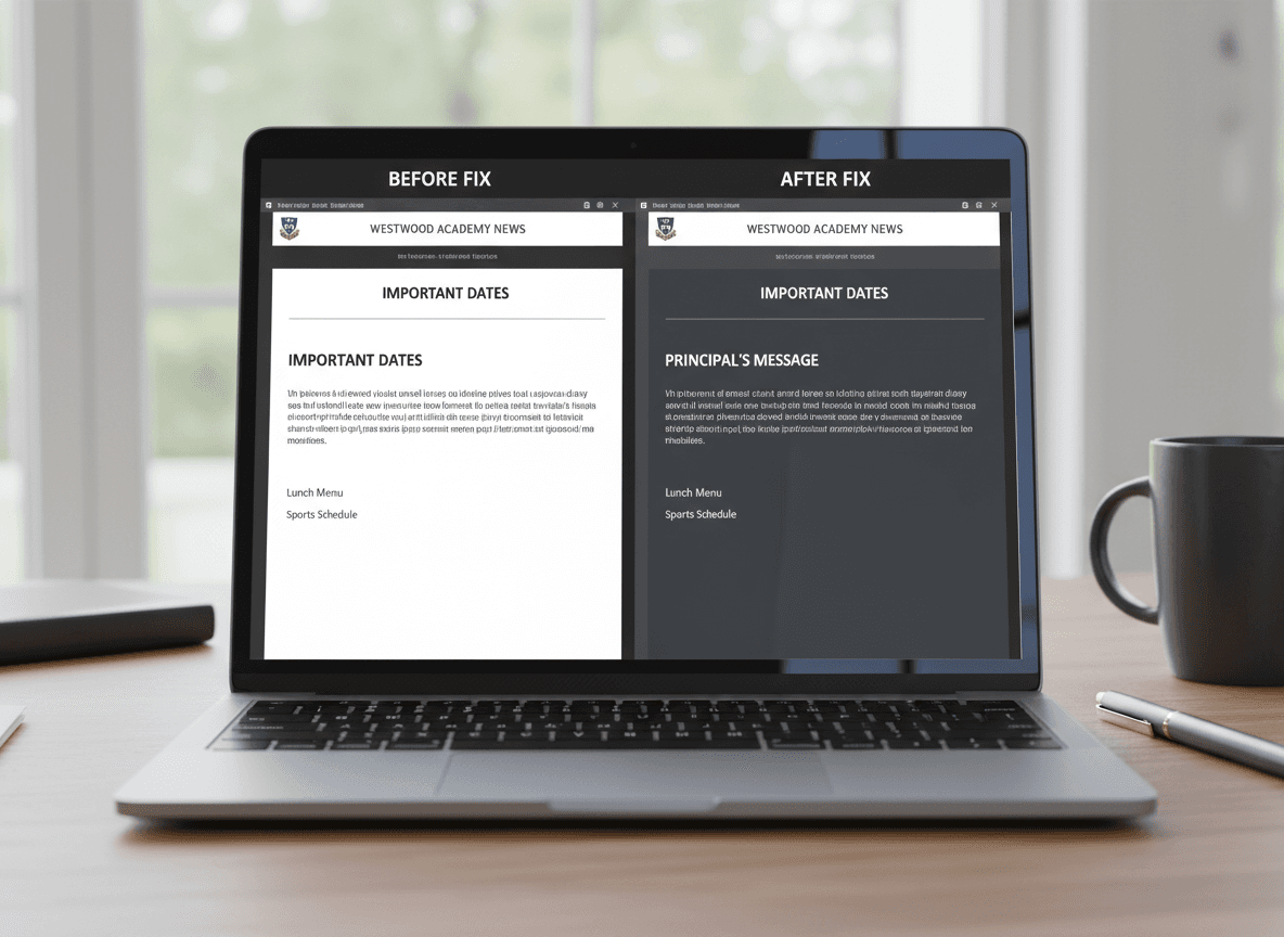
Colored accents disappearing. A school newsletter with a color scheme using the school's colors (a blue header band, green accent lines) may render as a completely different palette in Outlook dark mode. The entire visual identity of the newsletter can change.
Low-contrast text becoming unreadable. If you use medium-gray text on a light gray background for secondary information (a common design choice), dark mode partial inversion can turn the background darker while leaving the text the same gray. The contrast ratio drops further and the text becomes difficult to read.
How major email clients handle dark mode
Apple Mail (iOS and macOS): Applies dark mode UI chrome around the email but generally respects explicitly declared background and text colors in the HTML. Emails that declare color values are relatively stable. Emails with transparent or no background declarations may have colors adjusted.
Gmail on Android: The most aggressive and least predictable dark mode implementation. Gmail analyzes the email's color scheme and applies transformations based on its algorithm. Light backgrounds turn dark. Some text colors are preserved, others are overridden. The behavior has changed multiple times and is not fully documented.
Gmail on iOS: More conservative than Android Gmail. Applies dark mode styling but with less aggressive color transformation. Generally more stable than Android Gmail.
Outlook (Windows): Full color inversion in some versions. Explicitly setting background colors on all elements (rather than relying on defaults) provides the most control.
Outlook (iOS and Android): Respects declared colors more reliably than desktop Outlook.
What teachers can control: the practical checklist
You cannot control how every email client renders dark mode, but you can make decisions that reduce the worst outcomes.
- Use PNG images with white or solid backgrounds instead of transparent ones. A logo on a white background rectangle will invert to a dark rectangle. A logo on transparent background may show the logo against an inverted dark background with no buffer, causing light elements to disappear. White background rectangles are more predictable.
- Set explicit background colors on all major sections. Rather than relying on the default white background, declare it explicitly in your template. This gives email clients a clear value to work with when deciding what to do in dark mode.
- Avoid white text anywhere except on explicitly dark backgrounds. Hidden white text used for preheader or spacing will appear when backgrounds invert.
- Use high contrast text and background combinations. Dark text on light backgrounds is more resilient to dark mode transformations than any other combination.
- Keep school logos and branding consistent with explicit color declarations. If your logo uses your school's blue color, declare that color in the logo's surrounding container so it is not dependent on the default background inverting correctly.
What MJML handles automatically
MJML (the email framework Daystage uses to compile newsletters) generates table-based HTML with explicit inline styles on every element. This means background colors, font colors, and structural declarations are all specified, rather than relying on inherited defaults. This approach is more resilient to dark mode transformations than newsletter tools that generate minimal or tag-based HTML.
MJML does not solve dark mode entirely (no technical approach does), but it eliminates some of the worst failures caused by missing color declarations and inherited styles that email clients override unpredictably.
How to test dark mode before sending
The most direct test: switch your phone to dark mode in settings, send yourself a test newsletter, and open it in Gmail and Apple Mail.
For more comprehensive testing without physical devices, Litmus and Email on Acid are paid tools that render email previews across dozens of email clients and dark mode configurations. For most teachers, the phone-based manual test is sufficient.
The things to look for during a dark mode test:
- Is the newsletter's text readable without adjusting the phone's settings?
- Does the school logo or any image appear correctly without missing elements?
- Is there any text that appears unexpectedly (hidden text becoming visible)?
- Do buttons and links remain visible and tappable?
If the newsletter passes a basic dark mode review in Gmail and Apple Mail, it will be acceptable across the majority of your parent community's devices. The edge cases involving Outlook for Windows are real but affect a smaller portion of most school parent populations.
The honest answer on dark mode
Perfect dark mode rendering across every email client is not achievable with current email technology. The email industry does not have a standardized dark mode specification. Every email client does something different, and the behavior changes with software updates.
What is achievable: a newsletter that is readable and functional in dark mode, even if it does not look identical to the light mode version. That is the appropriate goal. Focus on contrast, explicit color declarations, and avoiding transparent image backgrounds. Those three decisions prevent the worst outcomes.
Get one newsletter idea every week.
Free. For teachers. No spam.
Frequently asked questions
When does dark mode become a problem for school newsletters?
Dark mode affects roughly 40 to 50 percent of email opens on iOS and Android devices, so it is a real issue for any school newsletter sent to mobile users. The problem is most visible when a newsletter uses custom background colors or image-heavy layouts. Plain text newsletters with standard colors are minimally affected.
What design elements in school newsletters break most often in dark mode?
White background colors set inline on sections, light gray text, images with transparent backgrounds where the background color matters for readability, and logos in dark formats that disappear on dark backgrounds are the most common failures. Image-heavy newsletters are more vulnerable than text-based ones.
How should teachers test their school newsletters for dark mode before sending?
Send a test newsletter to yourself and open it in Gmail or Apple Mail on your phone with dark mode enabled. Check whether text remains readable, logos are visible, and section backgrounds render correctly. Doing this once when you first set up your template is usually sufficient. Test again whenever you make layout changes.
What are common dark mode mistakes in school newsletters?
Hardcoding white text on colored backgrounds is the most common mistake, because some email clients invert only the background while leaving the text white, making it invisible. Using transparent PNGs for logos without a fallback background color is a close second. Both are preventable with basic template-level choices.
What is the best tool for teachers who want school newsletters that handle dark mode automatically?
Daystage generates newsletters using MJML, which handles the most common dark mode rendering issues at the code level. Teachers do not need to manage email-client-specific CSS overrides. The framework makes decisions that reduce dark mode failures without requiring any technical knowledge from the teacher.

Adi Ackerman
Author
Adi Ackerman is a former classroom teacher and curriculum writer with 8 years in K-8 schools. She writes about school communication, parent engagement, and what actually works in real classrooms.
More for Guides
Ready to send your first newsletter?
3 newsletters free. No credit card. First one ready in under 5 minutes.
Get started free